12 Farmhouse Kitchen Ideas for a Timeless Decor
The farmhouse is one of the design concepts that are tagged to be homey and unpretentious. Their characters have their own way of distributing warmth throughout the space. From the type of material to be used up to the colors, the farmhouse defines the depth of the given space through exposed details and touches. To come up with the farmhouse kitchen of your dreams, allow us to introduce to you a few inspirations that will make a cooking space worthwhile. Take it as a stepping stone on how will you work on the farmhouse design of your own kitchen space. Make use of these 12 farmhouse kitchen ideas that will exhibit timeless decor.
- Defined Zones
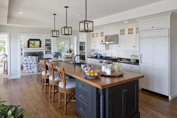

If you prefer the zones to be separated according to use, allow the materials to do the trick. As seen from the inspiration above, the wood did a good job in highlighting what needs to be put in the spotlight. The island table in the center is great for multi-purpose use. It acts as a bar, preparation table, and washing area. Against the wall, all the storage is combined altogether. Wood is put to good use polished to perfection in order to sustain the quality of the material. Ensure that the materials and finishes are placed according to the use of that particular area.
- Engineered Wood
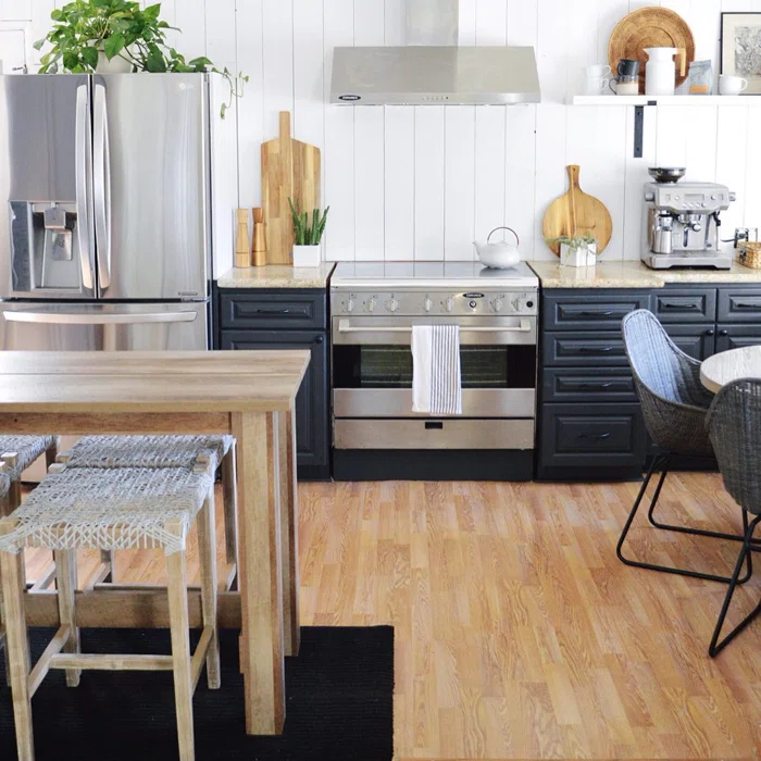

Wood never goes out of style when it comes to farmhouse design. It is all about how to finish the material to make a difference to the entire look. As seen in the image above, we love how wood is used in almost every element in the kitchen space. From the walls, cabinets, furniture, and flooring, wood dominates the space. It makes the kitchen look cozy and homey in spite of using vibrant colors. The vertical wooden panels used for the walls defined the height of the space as if it is continuously flowing to the panels of the floors.
- Modern Farmhouse
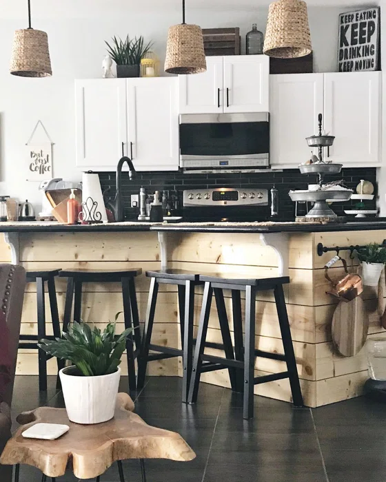

On a more modern note, it would be best to engage and utilize a variety of wood pieces that makes a difference to the entire space. As seen in the image above, they created a color palette that defines the edges and provides a clean finish. We all know how messy the kitchen could be considering how wet and dusty things can be. We highly suggest using tiles or any waterproof material for the wet zones. This allows the space to be more coordinated when it comes to the various activities it houses. From cooking, preparing, and even dining, you will love how the elements complement one another.
- Plains and Patterns
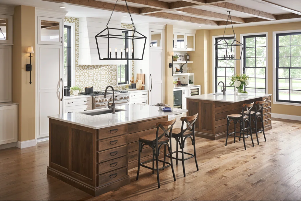

If you prefer to retain the traditional vibe of a space, you will love how modern meets vintage from this inspiration. The designers combined plain, printed, and bold in this setup. You can observe how the materials fit perfectly to their designated use. The key design in this concept is the accent wall where the cooking area resides. They managed to work with a print on tiles to work with moisture from the cooking. They used wood panels to cover the hood of the range. It made an aesthetic impact on the cooking area. Even though the range looks modern, the cabinets obtain moldings that define the details of the space.
- Clean and Sleek Edges
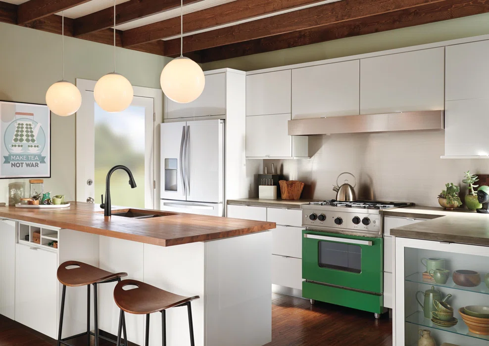

If you are up for a modern touch on the kitchen area, you will love this concept of a modern farmhouse. It maximized the use of wood that differs in terms of its classic finish. All the lines are clean and sleek that highlighting the modern touch. What we love about this inspiration is the kitchen island that works as a preparation, wash, and dining area. It gave more room for all the other activities in the kitchen, especially during cooking and baking. It made room for storage and exhibiting kitchenwares that add an aesthetic impact to the design. The old oak panels for the floors retain the antiquated character of farmhouse design that unifies the entire look of the kitchen.
- Chic Farmhouse
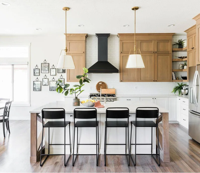

For a combined minimalist and industrial farmhouse design, unifying bold, saturated, and vibrant colors is the best way to go. It may not be an easy job to combine bricks with wood but they managed to experiment with the different finishes that can transform the look of your kitchen area. Black was used but in a very subtle way to make way for wood and bricks. They stood out in the cooking and dining area. It is all about making a difference from all the other elements. In designing a farmhouse kitchen, always remember that wood is the dominant material and that it should be protected and maintained at all costs.
- Rough Edges
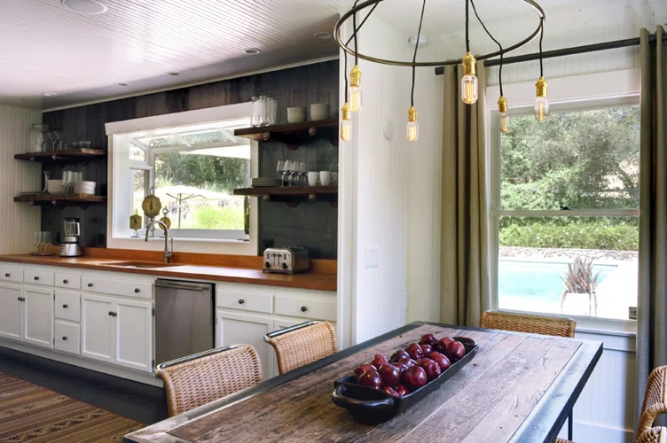

Farmhouse decor exhibits rustic and rough touches. It is the material that highlights the details and character of a space. In this case, we love how the kitchen area draws attention more than anything in the open-plan for the kitchen and dining. The designer opted for an accent wall to make a difference. The bay window helped in acquiring natural lighting during the day. Since they worked with an I-layout for the kitchen, everything needs to be squeezed in. In this case, they made room for exhibiting the glassware. It is not just about the decoration but as well as making it more convenient to be within reach. The counter is mainly set for all the appliances that are often used with additional storage beneath.
- Combined Materials
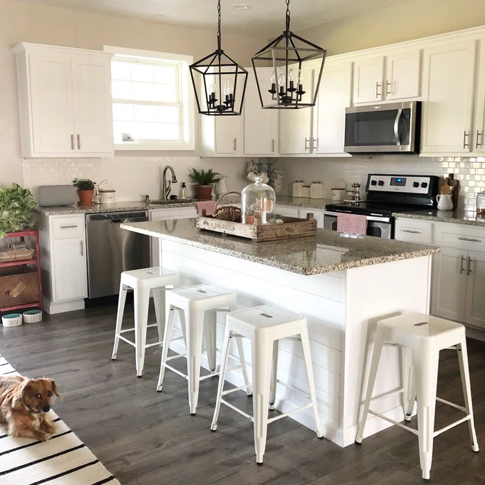

If you want to work with only one color, that is not a bad thing. Combine it with three types of materials instead. In this case, they opted for quartz for the countertops, tiles for the walls, and laminated flooring for the floors. It takes a lot of creativity to mix these types of materials and blend well. This is ideal if you are up for a simple yet impactful design for a kitchen. It makes room for the cooking area and even designated a breakfast nook to gather the family in the morning. The kitchen’s vibe is important in order to allow the household to feel a sense of belongingness to the entire house. Always remember to design according to the needs of the household.
- Taste of Yesterday
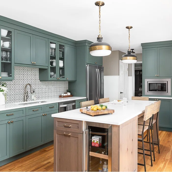

If you prefer the antiquated and classic design of farmhouses, this inspiration will be a steal for you. We love how the appliances are fit to perfection within the cabinetry in the kitchen. They made room for these pieces in order to prevent consuming the space on the counters. The island works as both a breakfast nook and a preparation area which is ideal for small kitchen spaces. They opted for an L-shaped layout with the island table as the core of the design. To top it off, we love the Machuca tiles on the accent wall. It creates a sudden stop from the plain surfaces of the cabinets and countertops.
- Monotonous Space
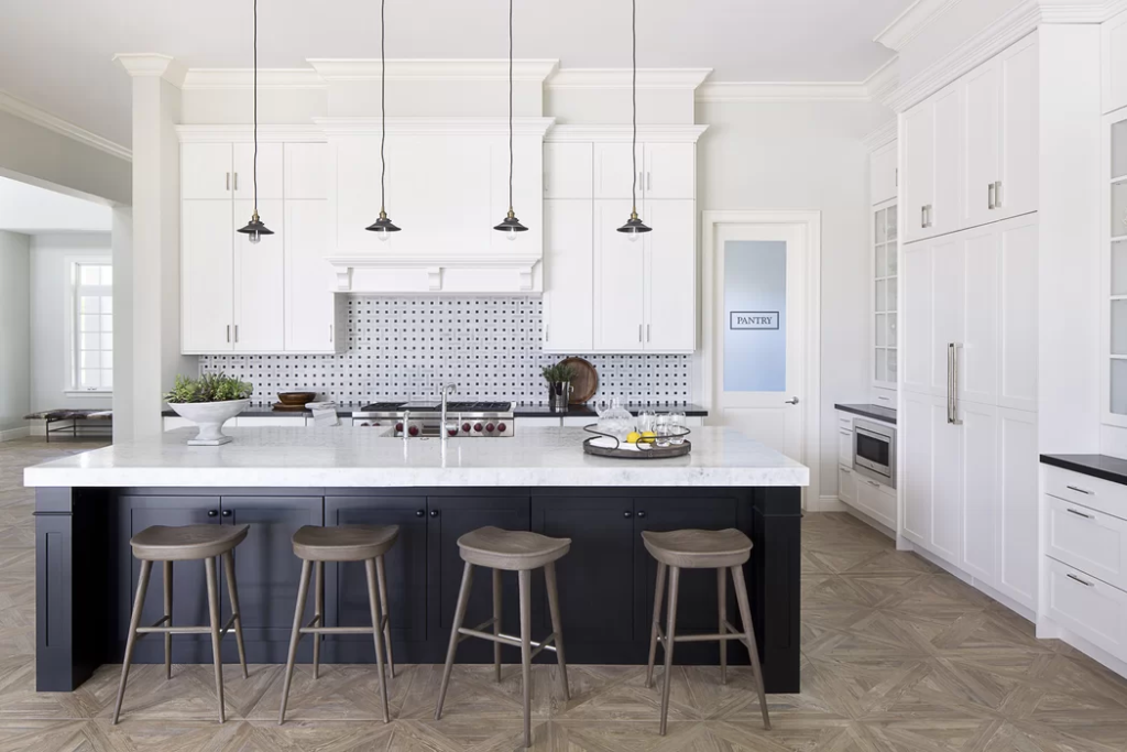

If you want to take a turn in the modern farmhouse concept, this one will make you realize how simple it can be to achieve the kitchen of your dreams. White did a pretty good job in making the kitchen area look clean and organized. White made the walls look lengthy as if you are working in a kitchen with a high ceiling. It created an illusion that the area is vibrant and spacious. To cut it out, a kitchen island in a relatively darker color is used. They combined both matte and glossy in terms of finishes to balance out and weigh in the activities done within these areas.
- Saturated Space
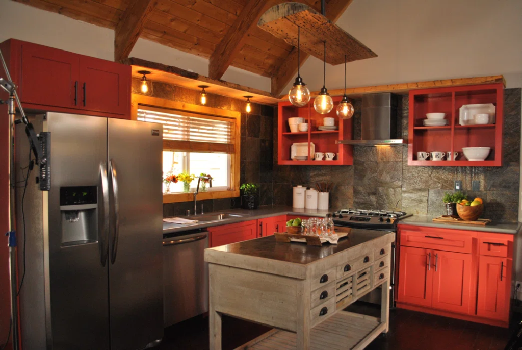

For a cozy and homey feel, draw the attention of the guests to the kitchen by making use of a saturated palette. We love how warm and inviting this concept is. This is ideal, especially for those with homes retaining the antiquated environment but with a dash of modernity. The kitchen island is made from sanded barks of wood in a matte finish. It gave a whole new look at how preparation areas should be. It is topped off by a solid surface to prevent water and moisture from soaking in the core of the wood. They picked a striking color for the cabinets. Red-orange made the kitchen warmer. With the right amount of white and yellow lights, the ambiance of the kitchen drives the household more to cook and prepare meals.
- Pattern on Pattern
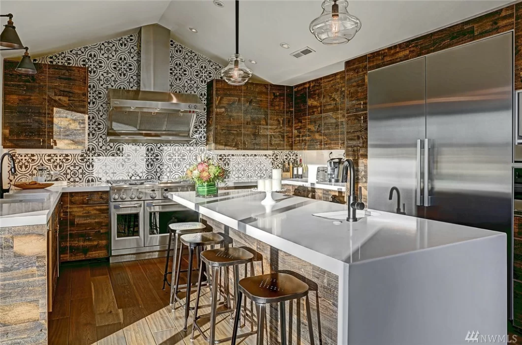

If you want to take risks and combine a variety of materials, take inspiration from the image above. We love how rough materials are incorporated with sleek ones complementing one another. They created whole new imagery for farmhouse decor. From the countertops, walls, and even the cabinets, you can sense how modernity is combined with traditional design. They made sure that the design did not compromise the functionality between the zones of the kitchen. As a high-traffic area, they opted for materials that can be used on a long-term basis and increase the sale value of the house.
