11 Ideas for Grey Living Room
“Out with the old and in with the new,” as they say. It takes a lot of courage to design a space with grey as its dominant color. Grey is a color establishing equity and achromatic. It may be a dull color for some but it is the shades that bring together a revolutionary design. A boring color brought to life by textures and finishes. Designing your ideal grey living room is all about expressing creativity and going beyond your comfort zone. Who knew that it could spice up your ordinary living room? If you’re looking for inspiration for your next renovation project, check out these 11 ideas that you can use to influence your living room.
The Charcoal Finish
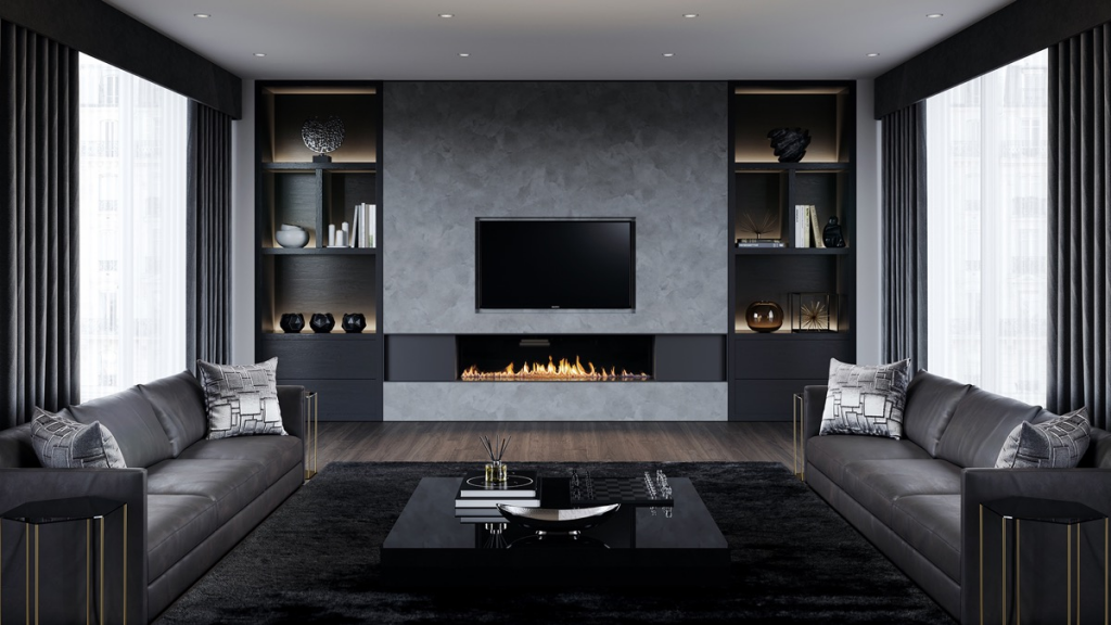

The color grey is bold and masculine. With the right preferences of textures and finishes, it has its way on how to define planes and surfaces. The Charcoal Finish is inspired by contemporary design elaborating order in elements and symmetry. The dominance of floor-to-ceiling windows provided opportunities for window treatments, a combination of white sheer textile overlaid by the dark grey drapes. At first, what is completely noticeable is the accent wall with recessed cabinetry. The textured and matte wall finish in light color highlighted the color of polished cabinetry and fireplace. This allowed the wall to stand out. It is an ideal option if all the other surfaces are curtain walls.
The Fifty Shades of Grey
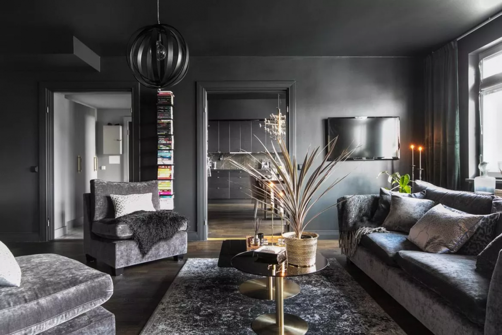

For a more sophisticated and sensual look, The Fifty Shades of Grey is an inspiration for bachelors and bachelorettes who are living alone. They are the ones who are rooting for a design incorporated with their personal preferences. It is a more personalized design which is a combination of pieces of furniture in iconic materials. As you can see, the image above from Hackrea is focused on soft textiles such as velvet and fleece. The sleek impact of the textiles draws more attention to the furniture rather than the other elements. The layering of the textures of the glossy walls highlighted the textiles. Besides, sometimes, utilizing different materials but of the same color delivers elegance and grandeur. Simple and achievable design
The Cool Tones
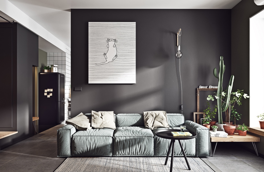

Grey is a flexible color built with a limitless combination of cool and warm colors. The Cool Tones is a design inspiration from Interior Design Ideas. The designer utilized deep cool grey color for the dominant wall to highlight the iconic pale blue grey couch. The light and dark colors overlaid with the other building materials enable a simple and achievable design. It may seem to look like an effortless design but the minimalist approach allowed each material used to stand out. The majority of the materials may seem to be plain and simple but what brought the entire design together is the flooring. It is slate grey concrete tiles giving The Cool Tones inspired by the industrial design. It gave away the ideal characteristic of an industrial approach in interior design.
The Monotonous Space
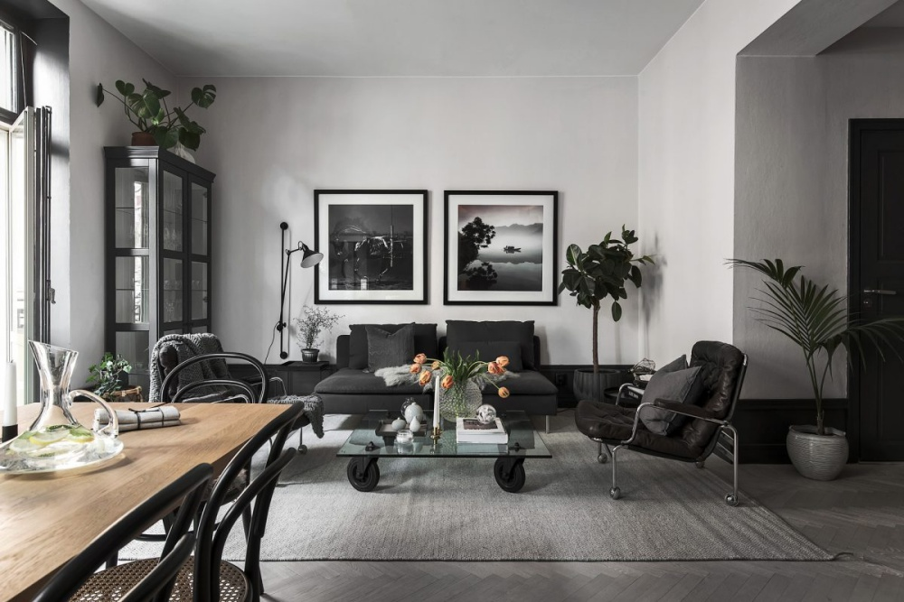

The cinematic decor of Minimal and Scandinavian Interiors Blog is monotonous in color. Most of the additional colors were just accents to bring life to the design. Even the interior botanical plants were dark green to match the design. The Monotonous Space paid attention to modern industrial design from the textiles to the pieces of furniture used. There is order in terms of the placement of the elements where everything can be seen at a distance. What would catch the heart of the guests is the combination of leather and chenille fabric for the upholstery.
The Industrial Decor
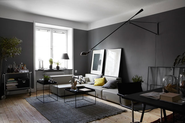

If you’re torn about choosing between rustic and industrial, in The Industrial Decor, you can work with both. This design type utilized wooden floor planks varnished lightly. Its natural color acted as the accent color of the entire design considering that the dominant colors are grey and white. The textile used for the upholstery is sleek. It neutralized the rough and rustic output of the flooring material. Considering that the color grey is about balance and order, The Industrial Decor works evidently in doing so. It is a combination of solid and hollow pieces of furniture. Established from the frames of the image and the coffee table, that is the easiest way to characterize it as industrial design.
The Patent Shades
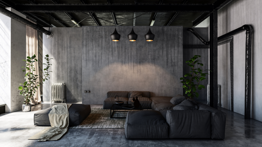

If you are rooting for a modern industrial decor in the shade grey, The Patent Shades would be your type. It is a combination of concrete finishes that bring out an industrial aesthetic effortlessly. The three walls seen on the design inspiration from Home Lanes are composed of different finishes. The accent wall, the one in the center, is in slate grey polished concrete. It allows the furniture to blend with the entire design. It takes a lot of risks to combining materials that seem to have the same visual aesthetic. The flooring is in rustic concrete polish. It made the impact more appealing for those who are a fan of the modern industrial approach.
The Light and Airy
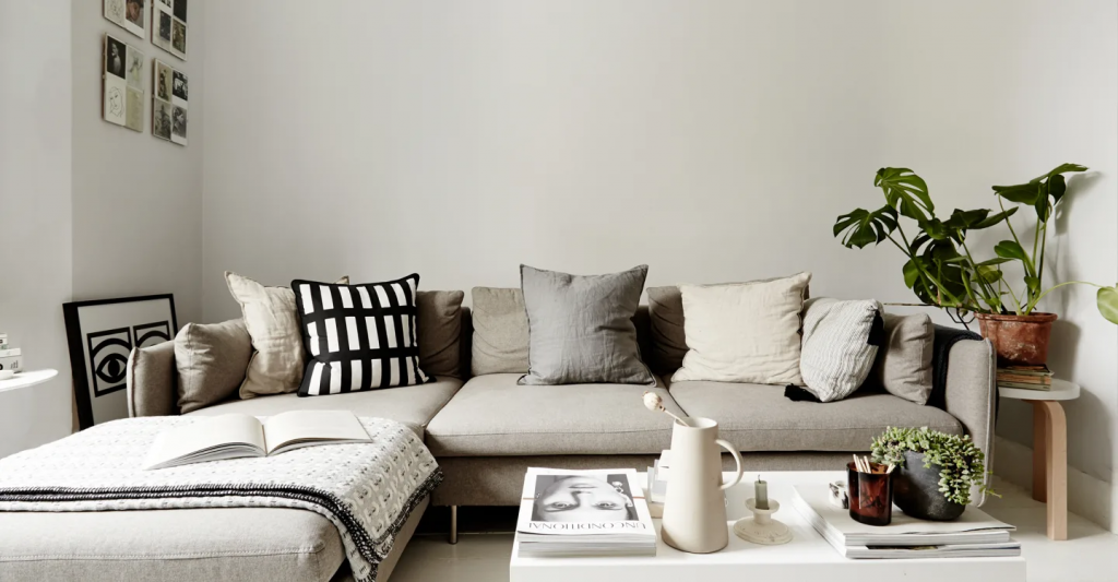

Keeping things light and simple is the primary characteristic of modernity. This design from MADE is a metro modern approach whose focal point is the functionality of the design. There are no complicated wall decors because the intent is to be plain straightforward. The greys are focused on the textiles used. They imposed layering in textiles to see the differences between the shades. This creates a cozy and comfortable ambiance for the guests and the household to enjoy. Based on the type of furniture used, the couch is centered to accommodate a minimal number of guests but its textile type taps the sense of comfort.
The Vague Colors
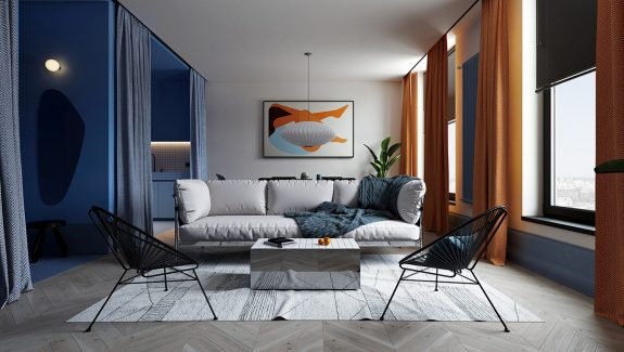

Grey may seem to be a pale color for some but combined with different contrasting colors it elaborates the details of a space. This design is inspired by a minimalist industrial approach that uses different geometrical shapes to define the details. Grey is used as a predominant color in this living area. The benefit of doing so is that the design was able to define the limits of the space. From the flooring to the color of the walls, grey allowed a sense of enlightenment to the semi-open plan design. It has set boundaries. There may not be many walls but the variations of color and texture did the trick. Besides, if the color grey alone is interesting, what more if it is incorporated with enthusiastic colors.
The Japanese Touch
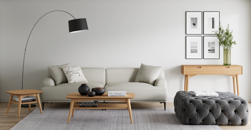

Grey is a flexible color that can go with literally anything. In any design, it is a neutralizing color that allows the other elements to stand out. This Japanese design from TLC Interiors is a concept that would satisfy your interest in minimalism. The sleek and rustic touch of materials of the textiles best fit the flat finish of the wall. The tones of grey used are very few, but different materials created a sense of individuality. More than just the colors, the types of furniture used are free from edges making it look sleek and comfy. Whether it just be for reading or housing guests, this living room concept can work both ways.
The Rustic Edge
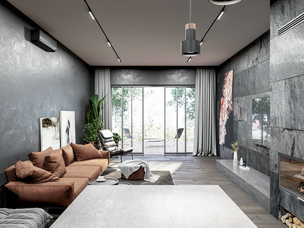

The modern Scandinavian concept is often amongst the choices of home renovations and design these days. More than just the aesthetic impact of the characteristics it possesses, the entire living room is filled with different rough materials. The rustic approach allows the different shades of grey used to stand out effectively. Grey may be the dominant color of the living room but thanks to the additional earthy colors, it gave a design that is inspired by nature. The textures of the walls and the use of shades of brown and green created an outdoor atmosphere indoors. Besides, living room designs should reflect the preferences and personality of the homeowner. Engage in concepts that you think would establish your comfort zone. Design the living room according to your daily activities.
The Sleek and Sophisticated
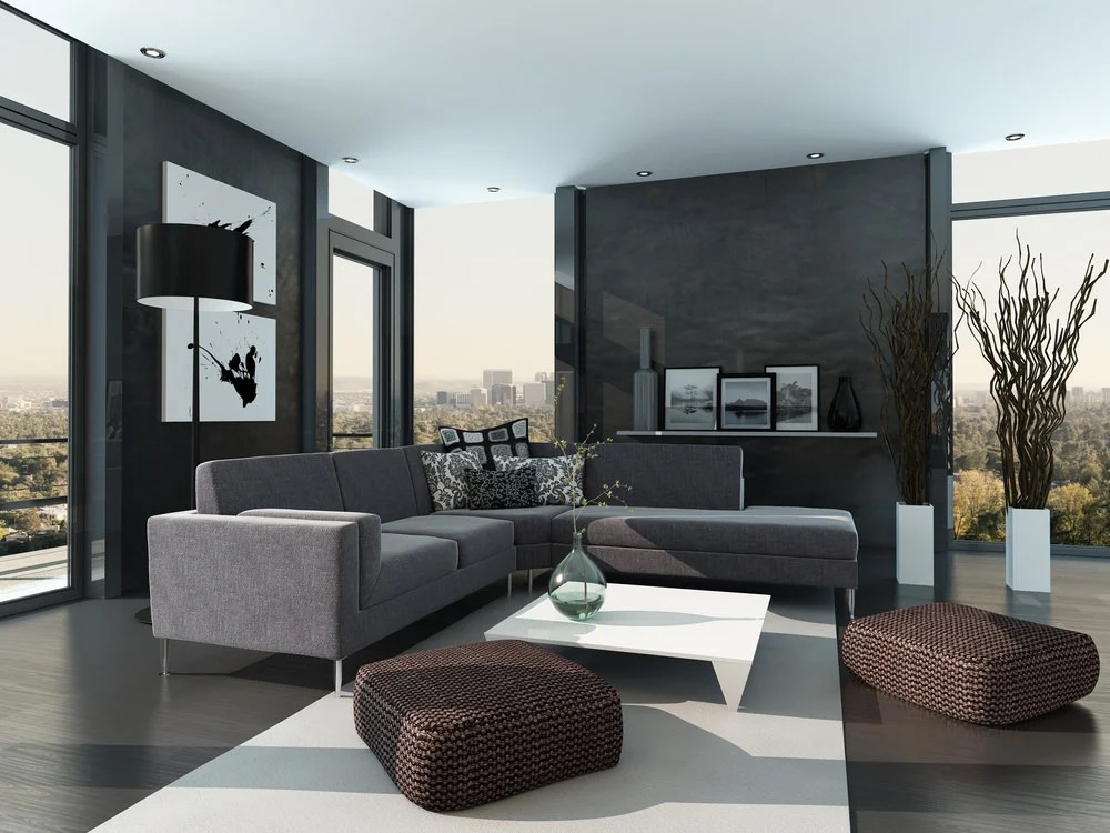

For a penthouse suite type of design, grey is often a color of grandeur and sophistication. It establishes a sense of dominance when used. To have a little floor show to spice up the atmosphere of the living room, it is better to use materials for the walls that can withdraw the idea that grey is dull. Teamed with white pieces such as the coffee table and the vases, it creates a rough output for the entire design. Thanks to the handcrafted footrest, its texture blends well with the smooth texture of the upholstered couch. The layering of the textiles only works if there is balance in smooth and rough textiles. It would be best to pick which surfaces would work effectively with the other materials used.
