12 Tips on How to Decorate an Open Kitchen and Living Room Layout
Open plan layouts highlight large open spaces with opportunities for sufficient ventilation and light. Its features do not only work for generous living spaces but as well as small studio ones. When pulled off, it introduces a whole new vibe for a home in terms of privacy, comfort, and warmth. Some people would find this idea daunting because of the lack of walls but there are other techniques on how to define the public areas at home. To give a little enlightenment, we have scooped 14 tips on how to decorate an open kitchen and living room layout perfect for remodeling projects this 2021. Wouldn’t it be nice to live in a non-conventional space for a home?
- Put Emphasis on the Vertical Height of the Space
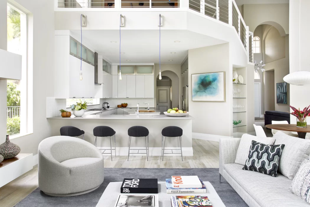

One of the top opportunities for open layouts is the vertical height of the space. It is similar to having your own lightwell at home. Take the opportunity to maximize the use of natural lighting throughout the house as a sustainable alternative to alternative lighting. Highlighting the vertical space of the house will require lengthy pendants and chandeliers. On the bright side, what is put on the walls will also have to adjust. This includes wall art and cabinets. Upgrade the scale of all the elements placed in the open layout to fill in the gaps. Instead of working with plane dining chairs and tables, a breakfast bar with bar stools is a great alternative.
- Experiment on Different Materials

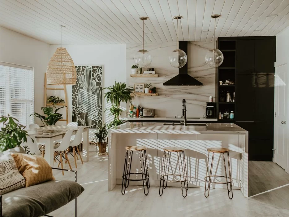
Different materials may seem to be a challenge for all but they will help in defining the kitchen and the living area. As seen in the image above, they combined concrete, wood, and marble indicated division in the open space. Even though the space is free from walls to divide them, the transition of space as emphasized by the materials did the trick. It made it look as if they were in two different rooms. The designer even worked with a massive carpet to set division on the floor of the living area. It sets the boundaries in terms of activities of the public spaces at home. Work with materials of different textures, colors, and details to overlay the aesthetic impact of the two different spaces.
- Work with Elevations
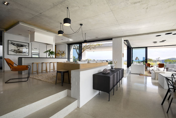

If you have an opportunity for open spaces with variating elevations, use that as a divider. In this case, we love how the kitchen, dining, and living area worked hand-in-hand in unison. Even with the lack of walls, the layout used is focused on establishing the activities done in both the kitchen and living area. As seen in the example above, the kitchen and dining area is elevated by approximately 400 millimeters for the two-step stairs. To enclose the kitchen and dining area, they opted for couch seating defining the line of the space. This is perfect, especially for collaborative activities such as eating together or having coffee. A little height would do the trick in establishing the purpose of the public spaces within your home.
- Try Different Layouts

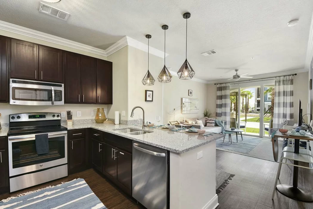
For small limited apartment spaces, it can be beneficial to work with an open plan layout rather than working with walled spaces. We love how the layout above worked for a small square space for an apartment. The combination of public spaces in one huge space enabled activities to be done with ease. From the kitchen and even the dining area, you can watch the television. In addition, it works for hosting a large group of people because of its increased seating capacity. The designer managed to maximize the use of all spaces. What we love the most is the breakfast bar with opportunities of being laid with the morning sun. It brings a productive vibe to all the spaces. Since it is a shared space, the dining table can also work as a workstation alongside. It is all about finding an alternative purpose for all the spaces.
- Make the Spaces Collaborative
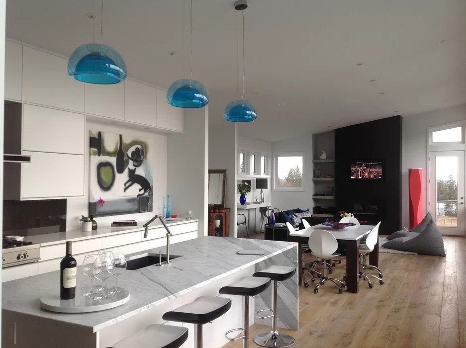

To define the privacy of all the public spaces within a home, working with a linear layout will do the trick. Apart from the fact that it provides more room for other activities, the linear layout makes the spaces more collaborative for the household. It brings the family together for warm-cooked meals and even entertainment. The designer did a pretty good job with the dining table to also act as a meeting table in cases of taking tasks from work at home. It provides a large space to house more than just cooking, dining, and entertaining. Collaborative spaces make the house make it feel like more of a home. Considering that each person has their personal space, having an open layout would indicate a safe space for the household to enjoy.
- Invest in Homey Furniture
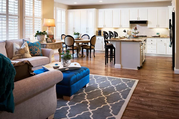

What makes the house a home is an ambiance built by everything in it. From the pieces of furniture, materials, textures, and lighting, everything is important in making a comfortable and livable space for the household. What better way of making it a dreamy place to live in than investing in homey furniture. It varies from one’s tastes to another but it would be best to work with the ones that suit your tastes and at the same time, tap the aesthetic impact for the desired home. From the example above, you can sense the taste for Contemporary design. The curvature in furniture canceled the metro modern vibe. It would be best to pick pieces of furniture indicating a warm and homey vibe for the house.
- Dominate with Light Colors
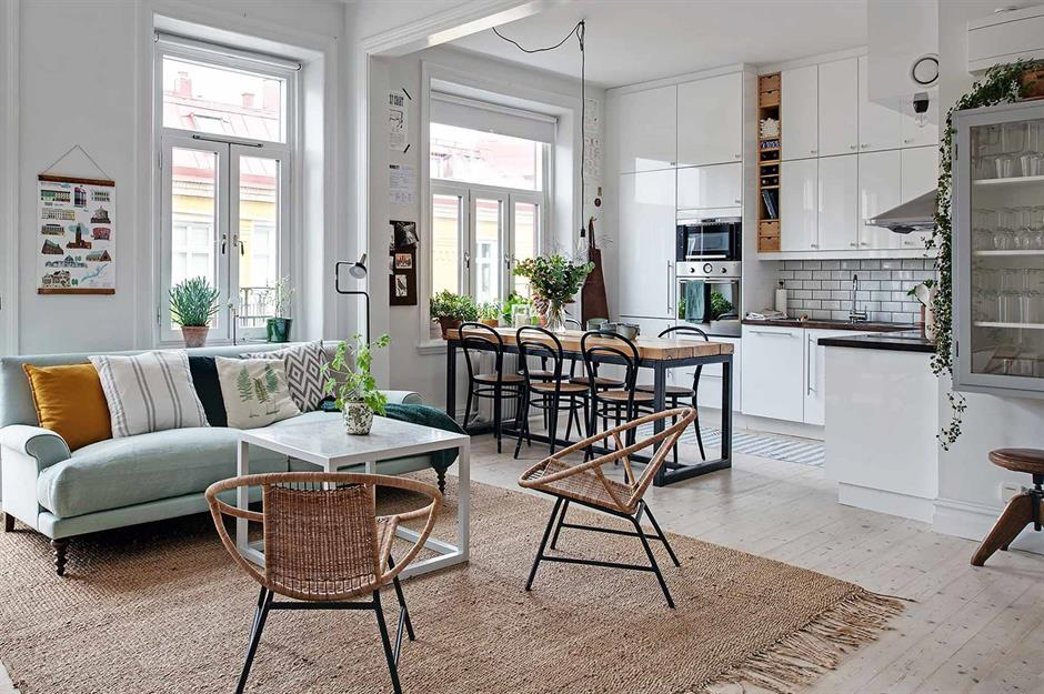

Open layouts combining the living, kitchen, and dining area are ought to make the house look spacious even if the space is limited. To make it even more enlightening to look at, it would be best to work with light colors to acquire opportunities for natural lighting and ventilation. Light colors such as white and beige create a homey and relaxed vibe for open space. The separation of zones will make the space more cohesive in spite of lacking walls to separate one another. It is one big area grouped and enabled efficient circulation for the public spaces unified the areas into one. White allowed the light to stretch throughout the entire living space. Imagine the light cascading through those clerestory windows indicating a refreshing feeling for a house.
- Focus on the Details
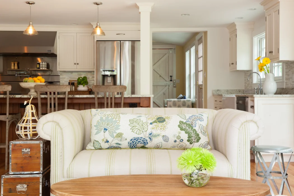

To make the open layout more defined between zones, work on focusing on the details of the materials and textiles used. It would not hurt to dominate the floors with the natural details of the wood. In addition, patterns also work as a mediator in filling the plain surfaces of the open layout. Work with florals, striped, checkered, or any pattern of choice to make a statement in the public areas of your home. For a family home, they often create a seating area adjacent to the kitchen area. This is a comfortable space where the household can join together. As much as possible, one of the tricks to make it homey is by introducing styles and designs that tap your interest.
- Locate the Kitchen Near Windows
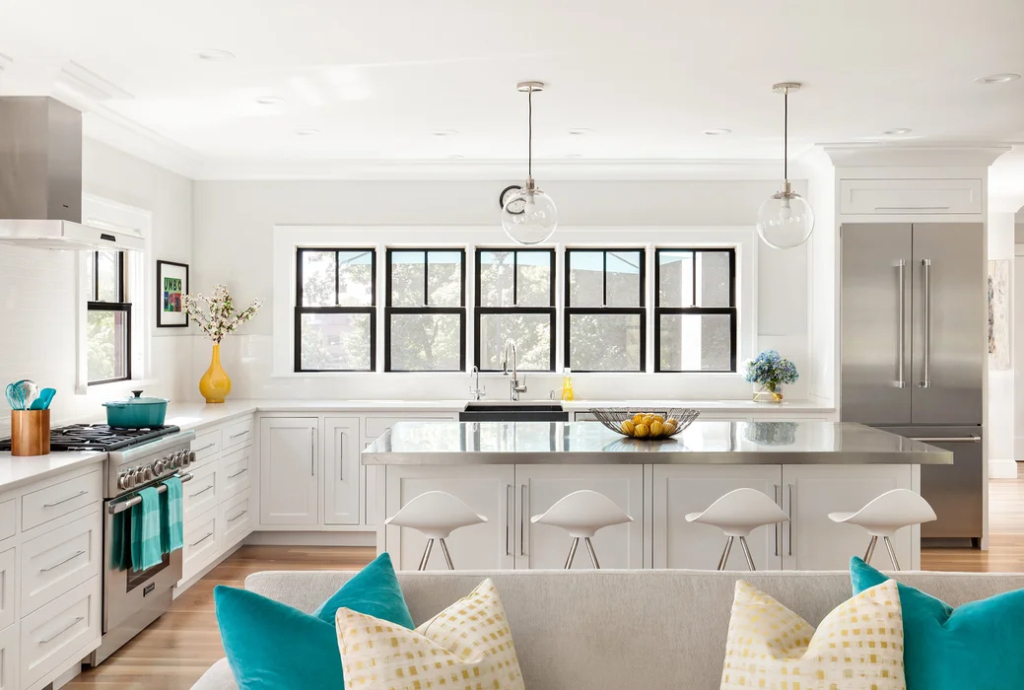

Open space layouts allow light to flow throughout the room. Locating the kitchen next to a series of windows will introduce a link to the landscapes. It would be great to have a view of the outside from the kitchen considering that it is the first place where you go right after waking up. Windows next to the kitchen is a great idea of preventing the cooking air to diffuse throughout the open space. Ventilation is important in open kitchen and living room layouts because the air circulating in one zone will affect all the other ones. If you do not have a kitchen hood, a series of windows will be a great alternative to prevent grease and pollutants during cooking to be released outdoors.
- Keep the Space Free From Clutter
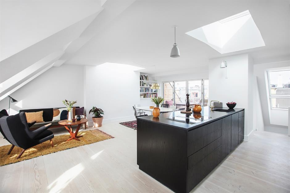

From a different perspective, open layouts combining the kitchen, living, and dining area will save you time in designing and cleaning three different zones. In terms of clutter, open layouts make clutter more visible even from a distance. Imagine having your kitchen all jammed up with unwashed dishes and it can be viewed from the living area when hosting guests. It is important to keep an eye on clutter when living in an open space. As much as possible, display and design the area only with the items that are necessary for the space. Remain to organize the space according to their designated zones to establish dominance over one another. This will define the purpose of each zone in an open layout.
- Invest in Eye-Catching Features
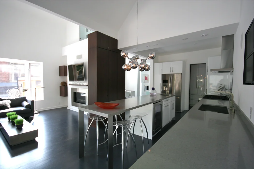

What better way of nailing the open layout than investing in eye-catching features that define the personality of the household. As seen in the example above, the open space is designed in the modern era with metallic touches introducing a futuristic design. The lighting fixture for the breakfast bar looks like a set of neurons pulled together in a metallic finish. Would not it be nice to have something to look at from a distance? This is one of the perfect ways of doing so. A little sparkle will do the trick in making the open layout feel more like home. It gives you a sight of almost everything all at once.
- Add Invisible Walls
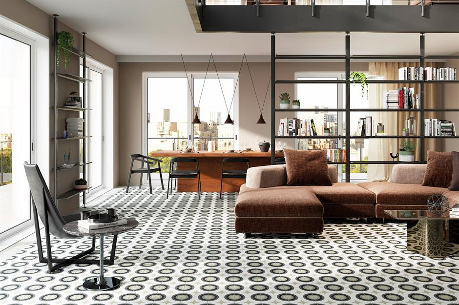

To add a little privacy or division without the walls, working with invisible ones will do the trick. The designer managed to put up a shelf that also acted as a divider. It is not even noticeable considering that you can see through from one point of the room to another. The shelf is the best place to display the things that seem interesting to you such as little botanical indoor plants, books, and even picture frames. The divider will add a little privacy to those who are in the living area while having someone work on the kitchen. It takes a little courage to spice up the open space with an invisible divider.
