How to Fill an Empty Corner in the Living Room – 11 Smart Ideas to Try
Awkward and empty corners in the living room are one of the most common dilemmas. These spaces are often too small for an ottoman or too big for a side table. At some point, blank spaces often are a waste of space inducing the idea that it makes the living room look spacious. The next option is to fill the void with the tips we were about to unveil. The good thing about these spaces is how they can be easily put to good use. Besides, it gives you a reason to redo and redesign the living room. Take a wide look at the living room and let us begin filling the void. We have 11 smart ideas to steal on how to fill an empty corner in the living room.
1. Rearrange the Layout of the Living Room
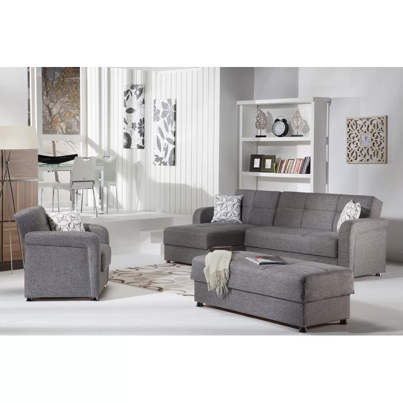

It remains a wonder how empty spaces became intentionally blank. Whether it be a new place you just moved into or an existing one, it can be inevitable. For those who do not want additional expenses for their living room’s redesign, we highly suggest rearrangement of the layout. If the existing layout is not working well and it does not maximize the space, there is something wrong with each furniture location. It would be best to focus on the groupings of the seating furniture and make it more accessible for the household and guests.
The layout of the living room plays a significant role in making it more functional. There is sufficient space present, the least that you can do is make the pieces of furniture work for the given space. C-layout, U-layout, and box layout is the common layouts used for a living room, and not because they are the standard does not necessarily mean it will work for all.
2. Layer Floor Coverings
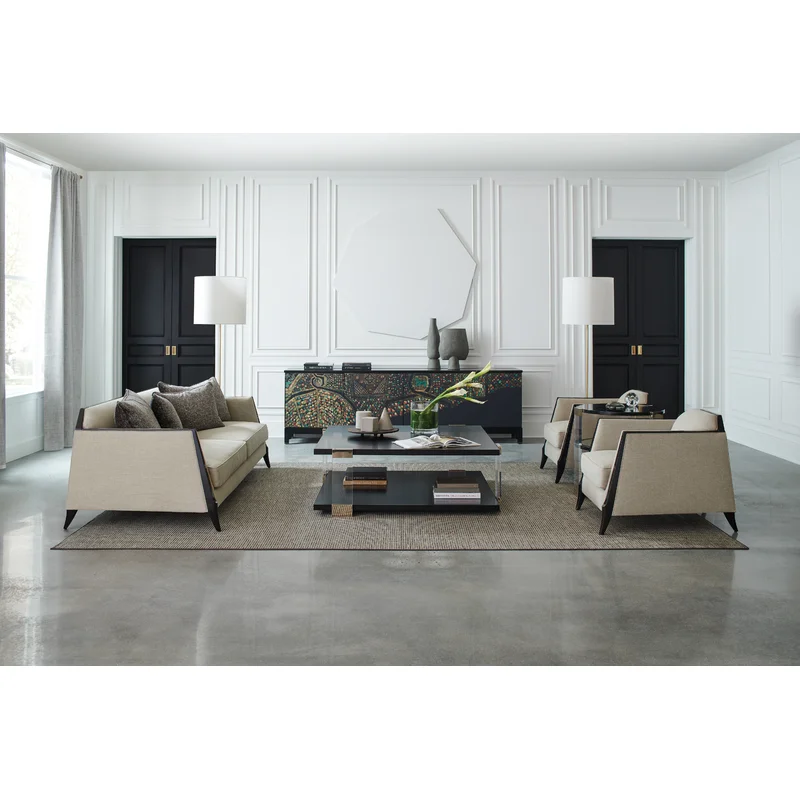

Apart from the layout, another key to filling the void is layering floor coverings whether it be rugs or carpets. They are often used to make the living room floor look warm and welcoming. Besides, they are easily customizable and come in a variety of designs too. Even though there is nothing in particular there, seeing the rug layered on the floor makes a difference. We highly suggest opting for a carpet that is either too dark or too light. This way, it would not look too gloomy and boring to look at. Adding another textile on the list would require additional cleaning and maintenance then and now. It would be best to always check in between and look out for accumulating dust or even dirt.
3. Plan the Zones of the Space
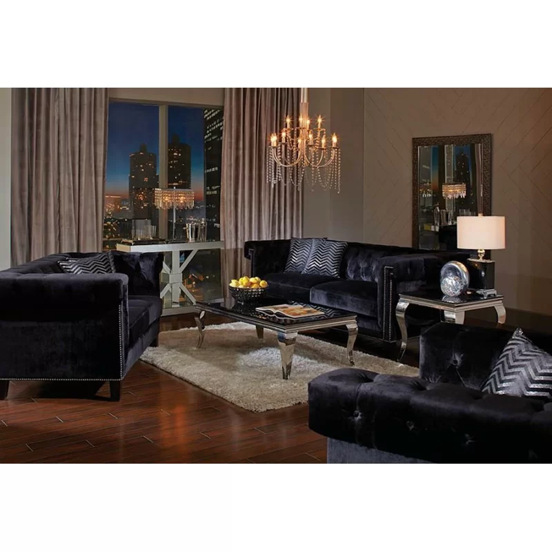

One of the common reasons why empty spaces are present in the living room is because the zones are not properly planned out. The first thing to designing a living room is setting the zones for the layout. Identify the activities that are done in the living room and decide what are the zones to be placed. It would be best to make room for storage, personal space, reading nook, workspace, or even an entertainment room. Be specific and practical as to why you want it in the living room. As the common space in the house with multiple purposes, you should ensure that all types are activities are well-catered to.
4. Organize a Display Storage
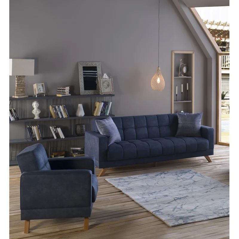

In every living room, storage is often taken for granted. To make the space look clutter-free, it is just right to organize display storage. This way, all collectibles, and other interesting pieces are kept in a place where they do not take space. Tiered storage in particular is what is needed. It highlights the vertical space and spends the floor space. As the most populous space in the house, the people in the household are often the ones taking part in leaving their belongings. Thus, the need for additional storage. It would be best to keep all items organized and are kept in place when they are not in use.
Display storage is not particular for keeping the items that are not in use. Instead, they are also used for exhibiting collectibles. When these collectibles are not arranged or organized, they just look like clutter lingering around the space. Whether it be a bookshelf or a glass shelf, as long as they are arranged and depict a good view, it is all good. Arranging and displaying a collection adds a decorative touch to the living room. Display storage is a great idea of showcasing a collection and adds character to the space.
5. Incorporate Indoor Botanical Plants
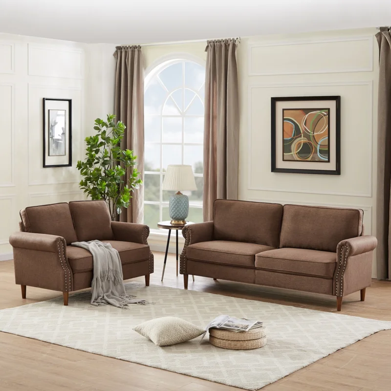

To have a refreshing touch to the design of the living room, botanical plants are the key. They come in a variety of sizes and they fit the empty spaces perfectly too. Prioritize the height and the width of the plant that will fill the blank corners of the living room. Measure the vertical and horizontal measurements of the living room. This way, the plant will not be too tall or too wide for the given space. Ensure that its location has access to sunlight to keep it alive. When it comes to indoor plants, it would be best to study the plant’s needs and characters too. We highly suggest knowing its maintenance requirements.
6. Illuminate Dark Spaces
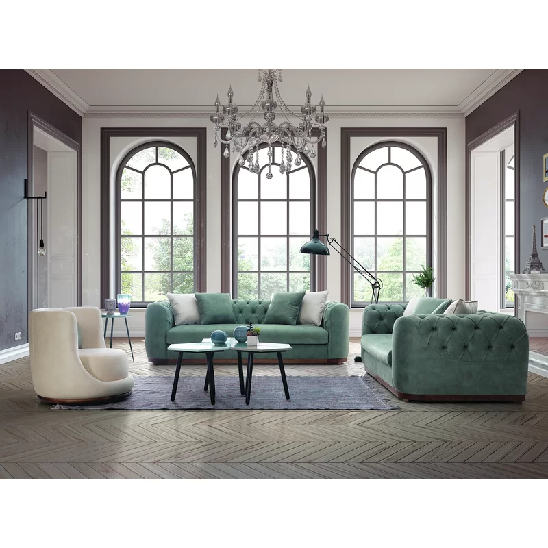

Blank corners are often the ones that remain dark and blank. Apart from it looking awkward, they are also the blank corners that are not acquired with natural and artificial lighting. We are not just talking about using pin lighting. There are plenty of lighting fixtures that can work. One of which is setting up a side table with a lamp on top of it. Whether it be accent lighting or direct lighting, it can be a good source for different activities. Layering the lighting sources of the living room creates a better aesthetic value and highlights the focal point in the living room. If you think there is a dull and lonely spot, it would be best to shed some light on it.
7. Opt for Sectional Couch
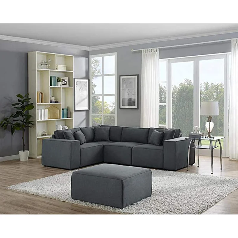

In designing an empty living room, most people often choose to work with a furniture set composed of a loveseat, armchair, and a sofa of the same design and composition. While it is stylish to look at, it can also come more expensive than having to pick your own set. For a smarter and cheaper alternative, opting for a sectional couch is a more radical way to go. It is comfortable, edgy, and stylish to look at which is the dept of finding the purpose of making the living room look aesthetically pleasing. They may come bigger than other seating furniture but they have the ability to cover even the blankest of space.
8. Work with a Darker Color Palette
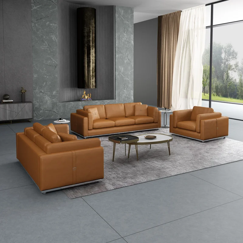

To prevent highlighting the empty corner, another option is to work with a darker color palette. It creates an illusion that the corny is not empty. It hides away the awkwardness of the blank space. The darker color palette includes hues and tones of black, grey, red, and blue. Be creative in choosing because we want to establish a warm and inviting environment without compromising the visual impact of the empty corners.
9. Create a Personal Space
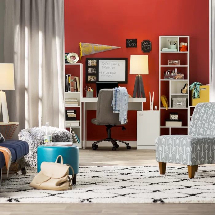

A living room acts as a multi-purpose space for the household. To make the most out of it, plan a space where you can do a variety of tasks at hand. Adding a personal space is the best way to do it. It is like having a part of you in the living room. It can be a workspace or a study area where you can complete tasks after school and work. Besides, it can be a bummer working inside the bedroom. Working in an environment that mimics one at school or in an office will suffice to retain a productive mood.
10. Upgrade the Scale of the Furniture
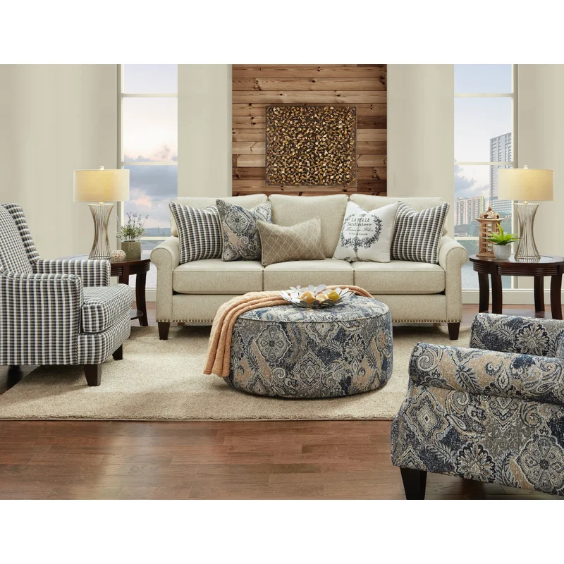

What better way of filling up a hollow void than allowing your furniture to do the trick? If you do not prefer to make sudden and unnecessary changes, upscaling your furniture will suffice. Instead of opting for sleek and edgy seating furniture, turn the tables around and pick warm and chunky ones instead. Their chunky character will induce more shadows to fill the empty corner. If you do not want a piece of bigger furniture to dominate the living room, mixing and matching their sizes will make it work. It is all about balance and proportion. We would not want the living room to look designed for giants. We want to keep the scale aligned to the needs of the household and the guests.
11. Add More Seating Capacity
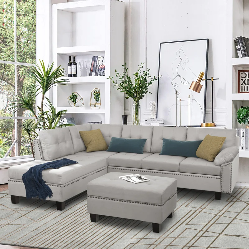

Instead of adding another table or another plant, filling the empty corner with a complimentary seat would make more room for the household and guests. Whether it be a loveseat, armchair, or just a seating block, adding a seat would indicate a more fulfilling way of filling an empty corner. It is more functional compared to the other ways and besides, it adds more seating capacity for the household and guests.
