13 Japandi Kitchen Design Ideas for Your Next Remodel Project
Japandi is also known as Scandinese is one of the popular trends of 2021 combining Japanese and Scandinavian interiors. With its similarity to minimalist design, you should expect clean and edgy elements to fill up your space. It is all about having a design with neat, natural, and organized characteristics. With all the bits from the different trends, Japandi is the perfect illustration of combined function and form to the interior. To save you time from browsing the web, we have gathered 13 inspirations for Japandi kitchen design for your next remodel project.
- White and Marble
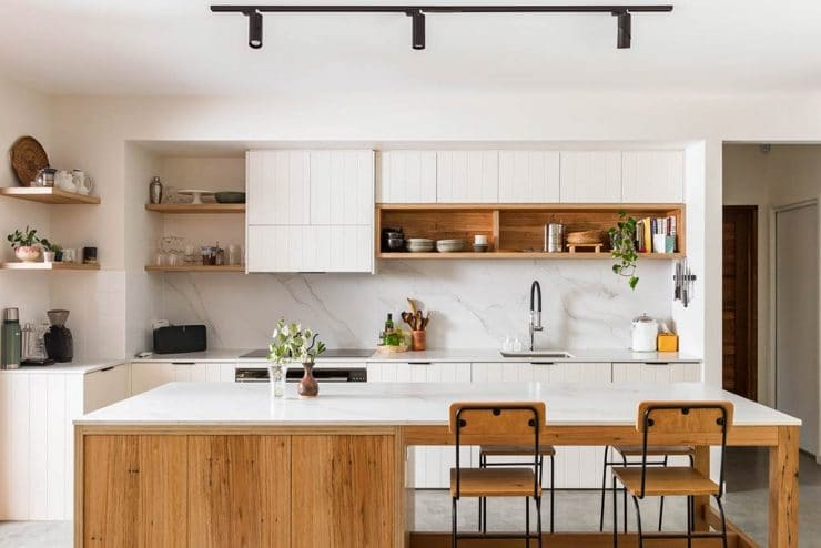

Combining flat and glossy white finish with marble exhibits sophistication perfect for the kitchen space. Kitchinsider’s inspiration for the Japandi interior style emphasizes the cleanliness and organization it portrays. In spite of its abundance of accessories, everything remains to be in order. Always remember the golden triangle in designing your kitchen. One end is for the sink, another for the cooking area, and the last one for the preparation area. This will make the activities more efficient and free from human traffic. Opting for glossy finishes is ideal, especially for wet areas. It makes it easier to clean and maintain compared to matte finishes. Since white is the dominant color, it is just right to think of finishes that are free from trouble to maintain.
- White and Off-White
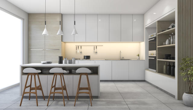

If you do not prefer your kitchen too white, combining it with off-white and cool greys will tap your interest. This color scheme keeps the ambiance light and airy. What we love about this design inspiration is how there is plenty of space for space-consuming activities. With the island table on the side, you can manage to make more space for preparation and storage. Checking out the preferences for the building materials, the use of glossy materials is dominant while engineered wood is the predominant one. What gave away the Japandi kitchen design is the organized arrangements of the kitchenwares.
- Neutral Touches
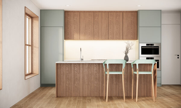

When using neutral touches for your Japandi kitchen, expect a variation of wood materials. It brings warmth and comfort to the kitchen to make the preparation of meals be on a lighter note. With how the kitchen is designed, there is plenty of space for storage that is not visible to the human eye. Keeping everything in the cabinet makes it look neat and free from clutter. Even though white is used less in this design, it still looks clean. Considering how a kitchen is used, it is best to use materials that are easier to maintain and clean.
- Bold Navy
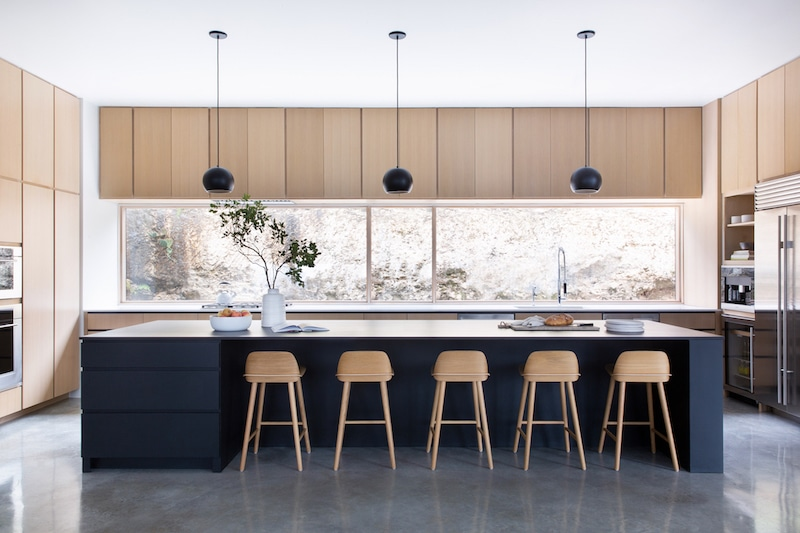

Another Japandi idea is combining light materials with a bold color such as navy blue. The dominant building material in this kitchen space is wood and the predominant material is the pale slate grey tiles. The light engineered wood for the cabinetry looks sleek and sophisticated. With its layout, there is plenty of room for preparation and hosting meals that can cater to up to five seating capacities. The glossy surface for the island table keeps the maintenance easier to manage, especially for the preparation of wet food. Having a huge source of natural lighting allows it to disperse to the entire room. For additional lighting sources, the pendant lights will build the mood for preparing dinner.
- Intimate Zen
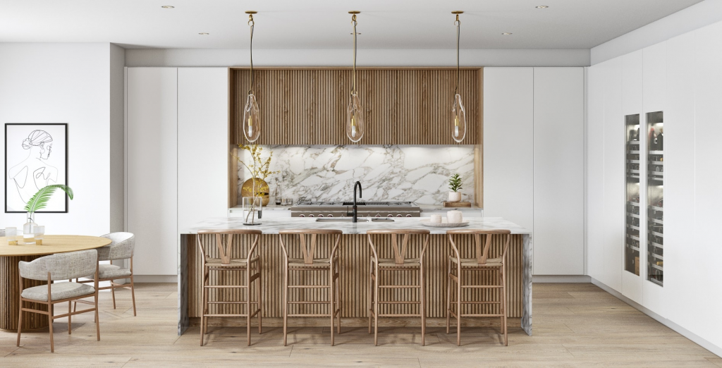

Japandi has always possessed the minimalist characteristic. Thus, resulting in the combination of linear wood paneling, marble tiles, and engineered wood panel flooring. The linear wood panels added a striped pattern to the kitchen to fill the void of the kitchen dominating with plain and flat surfaces. To accentuate the wood, marble is one of the most versatile materials to pair it with. What we love about this design from Sola Kitchens is how the arrangement of the kitchen is symmetrical. It kept the focus of the design to the center surrounding the activity area with storage to keep the flat surfaces clutter-free.
- Warm Turf
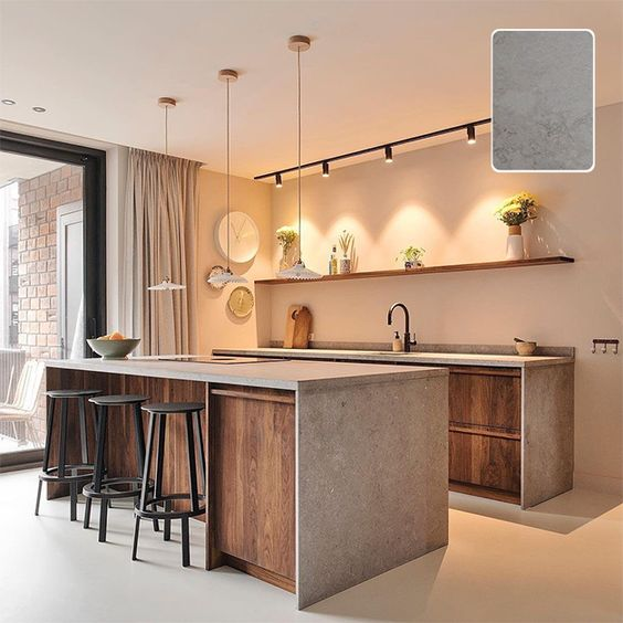

To keep a warm note to the typical light and airy Japandi kitchen, one of the factors to focus on to is the lighting. Always consider two lighting sources, natural and artificial. Dominating white walls is common in Japandi design. As it helps in acquiring light and building ambiance, it makes the kitchen look clean and neat. What we love about this kitchen design is how concrete is combined with old-aged oak wood. The edges are fine considering the absence of patterns in the design. To accentuate the colors of the island table, a bold matte black bar stool will do the trick. This layout is not only efficient for food preparation but as well as hosting meals. There is room for an intimate dinner with a bottle of wine.
- White and Wood
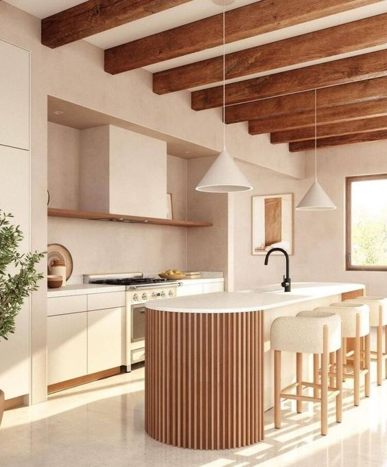

Nothing beats the beauty of white and wood in the Japandi interior for a kitchen. Considering the activities conducted in the kitchen, it tends to be messy and dirty. Using the right colors and materials helps in alleviating the common misconception about kitchens. Northern Styling aced the clean and minimalist look of Japandi. From the flooring to the walls, subtle warm colors were used. What we love about this design is the use of wood for the island kitchen and the bar stools. It makes meals with the family more intimate and delightful.
- Variating Materials
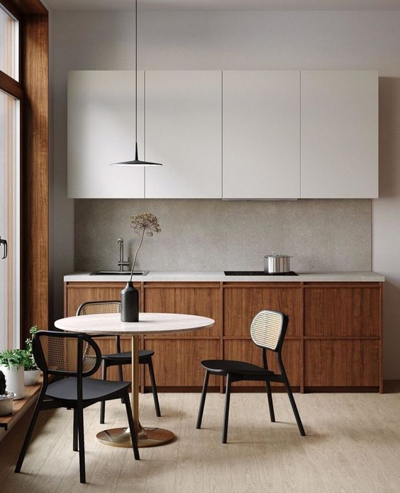

If you prefer the vibe of a coffee shop, The Kitchen House’s idea of a Japandi kitchen would interest you. You can start by choosing light engineered wood oak for the flooring to match the light and dark hues of the entire kitchen design. This mixed media design dominates in wood and predominates in concrete. The polished concrete for the I-shaped kitchen is perfect in cases of wet activities in the kitchen. It is a highly versatile material for cooking and washing. Alongside, to match the kitchenette perfectly, a three-seater dining area on the side would do the trick. For a bolder color, the light wood circular table is paired with matte black dining chairs.
- Concrete Finishes
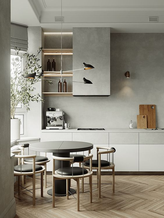

We love the industrial look polished concrete finishes make. In this case, combined with wood panels and hues of cool white managed to set dominance with the warmness of the material. A kitchenette in Japandi design is best in light colors to enlarge the space. Thanks to the window on the left, it helps the room in acquiring natural lighting. This is ideal for small and big spaces considering its layout. It still has enough room for heavy cooking activities in spite of having a mini dining table. This design is very aesthetic yet provides a functional design for the household to enjoy.
- Mid-Century Japandi
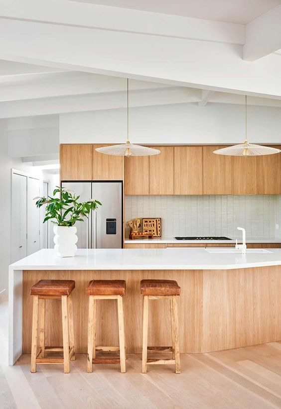

In Japandi kitchen design, what we are trying to avoid is the cluttered and messy spaces which are quite impossible considering the activities. Thanks to this inspiration for a Japandi kitchen, there is plenty of space for storage to house the functional items. Alongside, we do not want the space to look empty so putting little accessories would do the trick. We love how the design introduced an intricate design for the tiles combined with a glossy white surface for the island table. Paired with intimate light-polished wood, it is the minimalist aesthetic perfect for your kitchen. It brings joy to the ambiance of the kitchen. A key tip in designing a clutter-free kitchen is to make space for the hanging cabinets and the countertops.
- Cool Tones
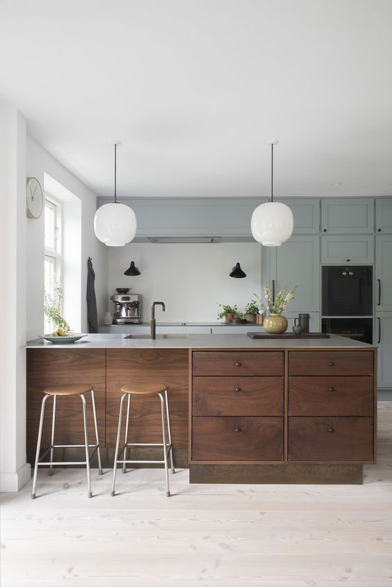

For a cooler aesthetic, consider opting for pastel cool grey tones to dominate your Japandi kitchen. It may not be your first choice in terms of color preferences but this color scheme will surely get you interested. Paired with old-oak finishes for the cabinets and drawers, it balances the light and dark hues of the colors used. The layout used for the kitchen is the working triangle which is ideal for a busy household. They also managed to add two bar stools on the side for a sumptuous breakfast with the sun illuminating the kitchen. With plenty of room for storage, there is no need for worrying about the clutter since there is a space for every appliance.
- Stone and Wood
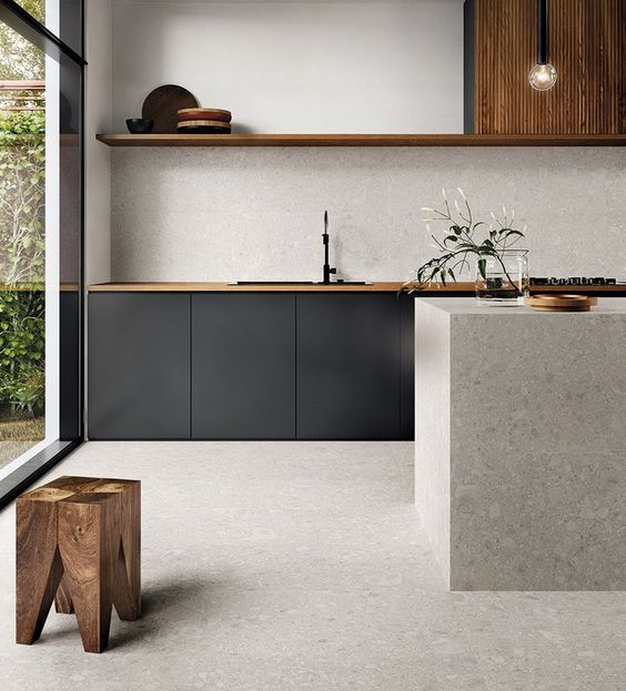

If you prefer the clean and sophisticated look of Japandi design, combining stone and wood would do the trick. CERAGRES aced the minimalistic look for a kitchen. They stuck with bold matte black and brown colors for the countertops with plenty of storage for the appliances. On the side, we love the massive cubic island table for the preparation of the food. To accentuate the design, they managed to do a single shelf on top of the countertop to reveal a little aesthetic for the accessories. Blending stone and wood for this design tapped the Nordic characteristics of a Scandinavian design style.
