12 Japandi Living Room Ideas for Your Next Remodel Project
Japandi is one of the popular design trends of 2021 combining Japanese and Scandinavian interior design. This modern minimalist trend is a perfect idea to spice up your living room. With its clean and polished characteristics, this interior is often topped with iconic statement pieces. Unlike other design inspirations, it takes decorations lightly. This is what makes the living room more comfortable to stay in. It is one of the styles often mistaken as minimalist interior but it is the Nordic touches that define the character of the living room. We have gathered 12 Japandi living room ideas that might interest you for your next remodel project.
- Nudes
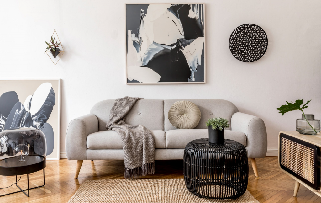

Updated with contemporary pieces, Vas Nair Design managed to nail the minimalist aesthetic using a nude color scheme. The chunky warm beige sofa combined with the mesh coffee table defines the Japandi style. If you prefer a little mix and match, the best thing to do is to add subtle amounts of color to accentuate the design. In this case, the blanket, side table, and throw pillow. The darks and lights are well-balanced. Even though it is abundant in accessories, the design remains clean and light to look at. To nail the Japandi design, it takes a lot of courage to add small botanical pieces for refreshing imagery.
- Monochromatic
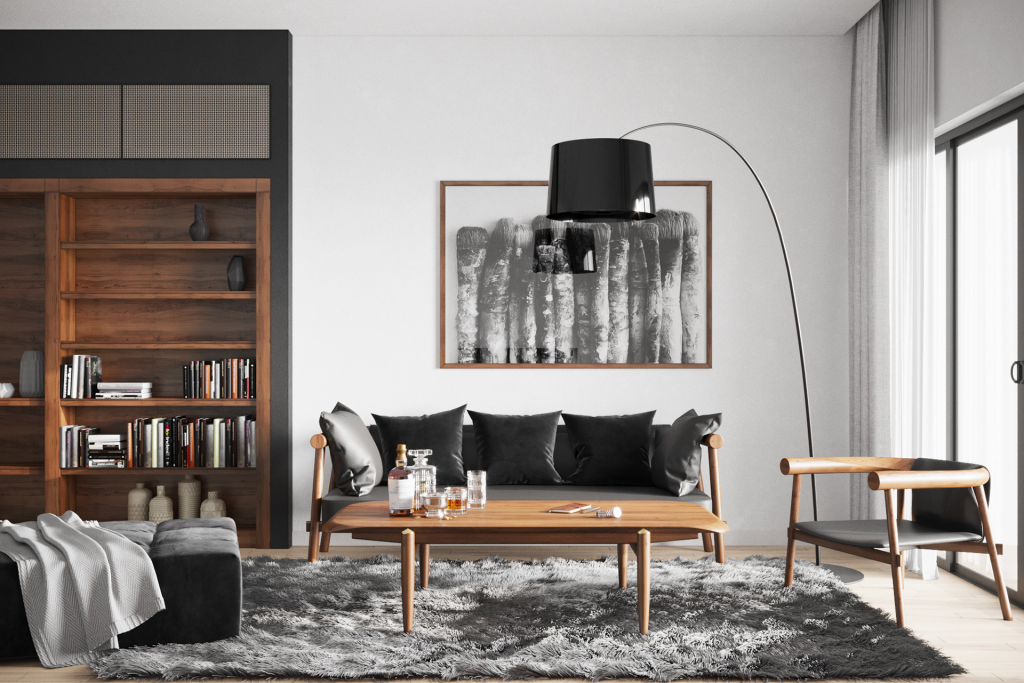

If you are having trouble picking the perfect color scheme, a monochromatic scheme is the best way to ace the Japandi style. The sleek materials of leather and wood allowed Behance’s inspiration to indicate intricacy and sophistication in the design. The minimalistic vibe kept the design arranged accordingly. What we love about it more is the iconic floor lamp. It defined the curvature of the lighting and the furniture. In the Japandi style, always consider which one should be more dominant. To add a soft note to the design, they opted for a variation of textiles indicating comfort.
- Olive Garden
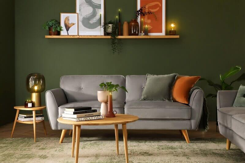

In Japandi design, it often starts with a warm white base for the walls but Archi Living turned the tables around. They started with a bold olive green for the walls and use a lighter color to accentuate the living room. Even though the color scheme is too warm, they still managed to acquire natural lighting bouncing from the flooring to the furniture in place. Combining green with browns and greys gave a more muted note to the living room. The massive statement couch looks so inviting to cater to guests. Always remember, you can never go wrong with pairing the elements with modern engineered wood for the coffee table and the side table.
- Cozy Whites
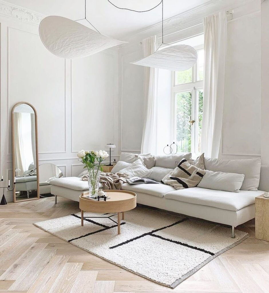

You can never go wrong with cool white walls since that is the iconic character of both Japanese and Scandinavian design styles. Using a variation of off-whites and wood makes the perfect combination for a cozy living room. To define the dept of the living room, the wall moldings helped a lot. The moldings made it okay in spite of the absence of the wall decor. To add a little statement piece, a curved full-body mirror leaning against the wall did the trick. It is the asset of the Japanese-Scandinavian fusion. In addition, take note of being subtle with the patterns to use. In this case, the patterns for the textiles such as the carpet and throw pillow are very minimal.
- Neutral Hues
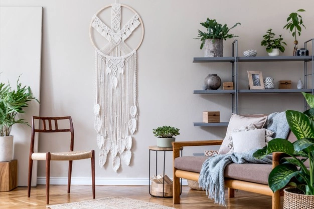

To give a clean and minimalist look, Japandi dominates in light and subtle colors. Often found in neutral hues, the most popular colors for this design style comes in white, brown, and green. Thanks to this amazing design inspiration from Freepik, they gave a refreshing taste for the living room. Variations of wood materials were used to fill the void of the absence of heavy patterns. From the seating furniture, it is best to invest in a couch classically inclined to feature a more relaxing note. For a more organized decoration, an industrial shelf would do the trick to exhibit your statement pieces and even mini botanical plants.
- Scandi Suite
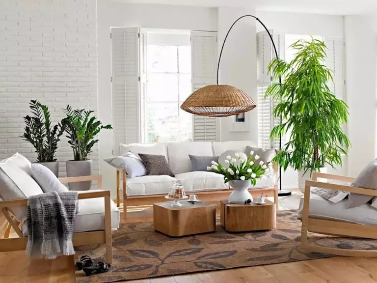

This Scandi suite is composed of a muted color palette making it look clean and in order. From the walls to the cushions, the palette is accentuated with warm hues of grey. The wooden planks and wooden structural pieces of the furniture blended with the whites perfectly. It may be too minimalist but matched with the curvature floor lamp. The decorations used were subtle but they sure did make a statement. To add a refreshing note to the living room, nothing beats what indoor botanical plants can do.
- Clean Slate
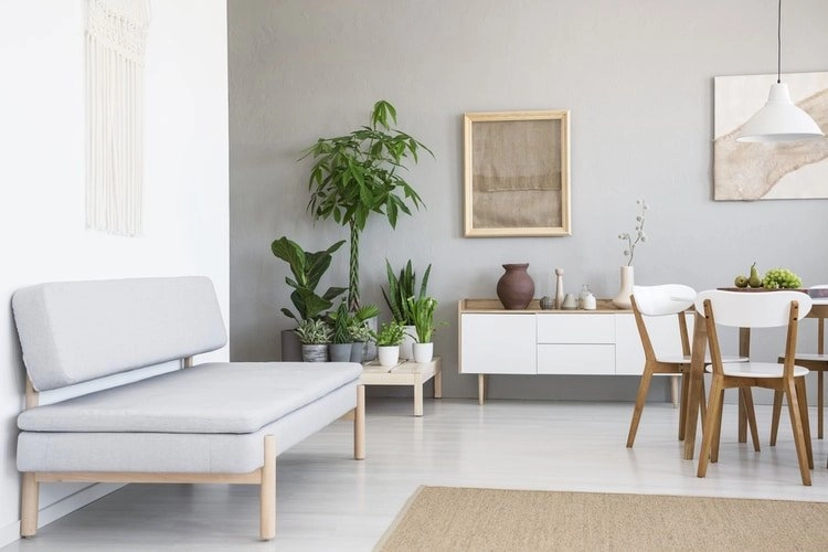

If you are a fan of whites, you have every reason to consider Modern Cabin Living’s idea of a Japandi design. Common in apartment and loft setups are open plans where the dining room and the living room are combined to share the space. This may seem to be a simple approach but it works effectively. This iconic edgy couch looks warm and comfortable to lounge on. In spite of its limited seating capacity, being next to the dining room is an opportunity. Combining white with warm grey and off-white results in clean and aesthetic imagery of Japandi. Because of the limited space, focus on what you can hang on the walls for decorations of the same color or in a different hue.
- Cold Crates
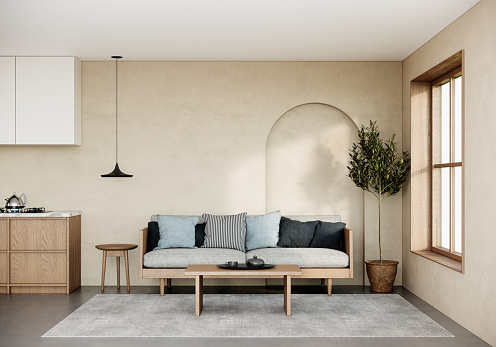

Japandi design often comes in white walls when in fact you can flavor the walls with cool beige for walls. We love how iStock highlighted the accent wall through a curved recessed wall on the side. Since it is also in an open-plan setup, being adjacent to the window is an opportunity to acquire natural lighting. To define the character of Japandi, uniform wood material did the trick. As the dominant building material, it would be best to add cool colors. In this case, they added variations of the color blue for the throw pillows on the couch with a cool grey cushion.
- Subtle Blush
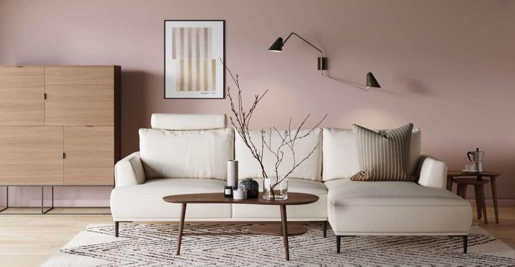

If you are not a fan of the white walls common in Japandi design, it is best to flavor it with a pastel pink blush. It acquires light and at the same time, it warms up the vibe of the living room. Pink adds passion and intimacy to the space. To add a statement piece to the design, the off-white sectional couch did the trick in doing so. The light colors of the scheme indicate a clean look. On the bright side, the oak wood floor panels matched the dark hues of the other wood materials effortlessly. In achieving a Japandi design, always consider the types of wood you prefer to opt for. Dark and light-colored woods tend to make a statement in minimalist interiors.
- Earthy Tones
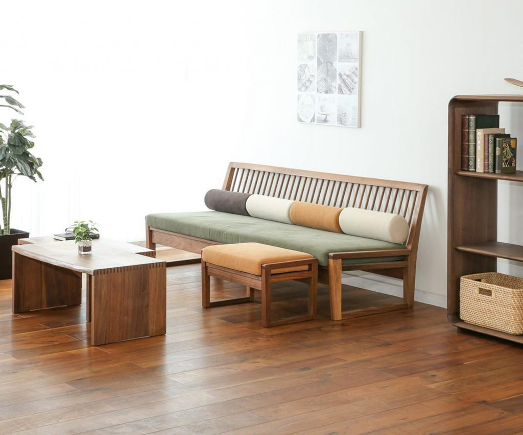

Japandi design often utilizes an ample amount of decorations to spice up the interior. We love this design in earthy tones of green, yellow ochre, grey, and off-white. Even though there is a definite color scheme used, the dominant color lies in the warm color of the pre-engineered wood. This is a pretty straightforward design for a living room where everything is simple and clean-looking. In designing the Japandi interior, always remember to opt for the minimalist style to maintain its clutter-free look. It looks light and airy perfect for achieving a well-light and well-ventilated living room. This is the perfect place where you can lounge and hang out with the household.
- Grey and Brown
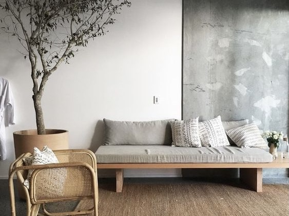

Nothing is too minimalist with grey and brown as the dominant colors for a Japandi interior design. To balance the warmness and coolness of the scheme, it is perfect to invest in wood-dominant materials such as rattan. The rattan-weaved armchair adds a more personal note for the minimalist character trying to be achieved. Lies on the simple wood bench is a warm grey cushion topped with variations of throw pillows in off-white patterns and warm grey textiles. To spice up the walls, they accentuated the surface with a concrete finish. On the side, they have a lengthy indoor botanical plant.
- Metro Modern
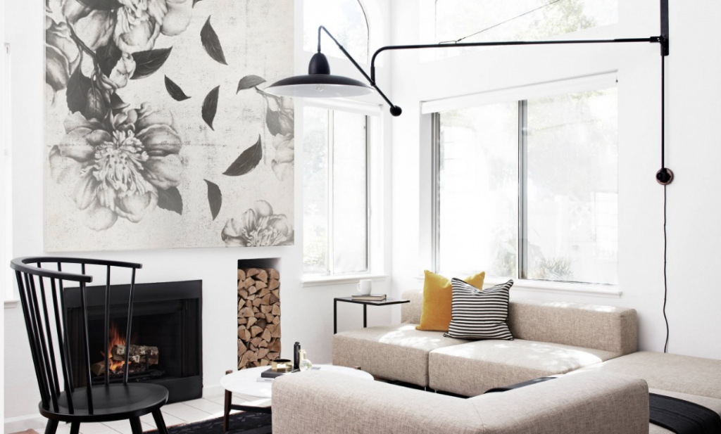

If you cannot keep your hands off these amazing wall pieces, the Japandi style incorporated with metro modern might interest you. We love how this accent wall integrates with a compact design combined with a fireplace and a holder for the wood. In spite of the large space designated for the living room, an interconnected sectional couch filled the void. It is very edgy in a grainy beige color. It may be bold imagery, to balance it out, adding an accentuating black chair on the side did the trick. The splash of colors is very minimal where the dominant color remains to be white. The white matte walls exhibited a clean minimalist aesthetic for the living room.
