14 Color Palette Ideas for the Kitchen to Take Inspiration From
The kitchen is often the busiest space at home during the time of meals. As a wet and dry area, choosing the color and material to use to dominate the space can be quite a challenge. Allow color to run its course and make the space feel more at home. Neutral colors may seem to be popular in the kitchen area but it is not a palette that works for all. The kitchen is an interesting space to remodel considering the variation of materials and colors to work with. We highly suggest choosing palettes that are close to the colors of the public spaces of the house. Picking up these accents will help in unifying the spaces altogether. To give inspiration, we have scooped 14 color palette ideas for the kitchen to be considered for your next remodel project.
- Green and Orange
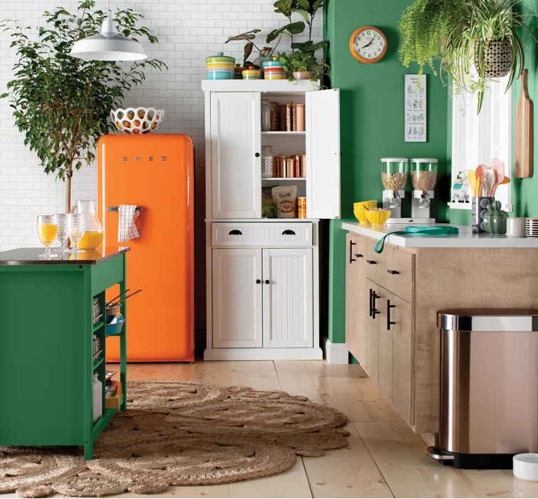

We love these refreshing colors of green and orange. It mimics the color of a carrot but in a striking and vibrant manner. This is ideal if you prefer a vibrant scheme to dominate the space. Orange has the ability to make the space looks warm and saturated. Meanwhile, green enables a refreshing vibe to the space. It is a color that sets a neutral ground as you cook and prepare meals. In this inspiration, the white color allowed a sense of balance to these striking colors. It helped in acquiring natural lighting to be diffused throughout the space.
- Clean White
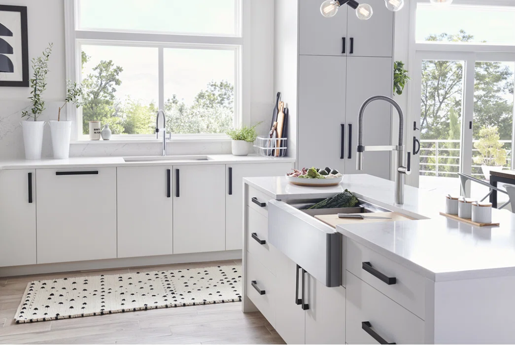

White is such a strong color. Working around it will make minimalists be interested in what they have to offer. They tend to make the space look clean and pure. It is easier to maintain and design compared to the other color palettes. Plain and simple is what we are rooting for when we use white for the house. As seen in the inspiration above, white made a huge difference to the imagery of the kitchen. Everything looks organized and in order. With the right type of materials, it established a sophisticated look leaving room for additional decoration and improvements.
- Stone Blue and Wood
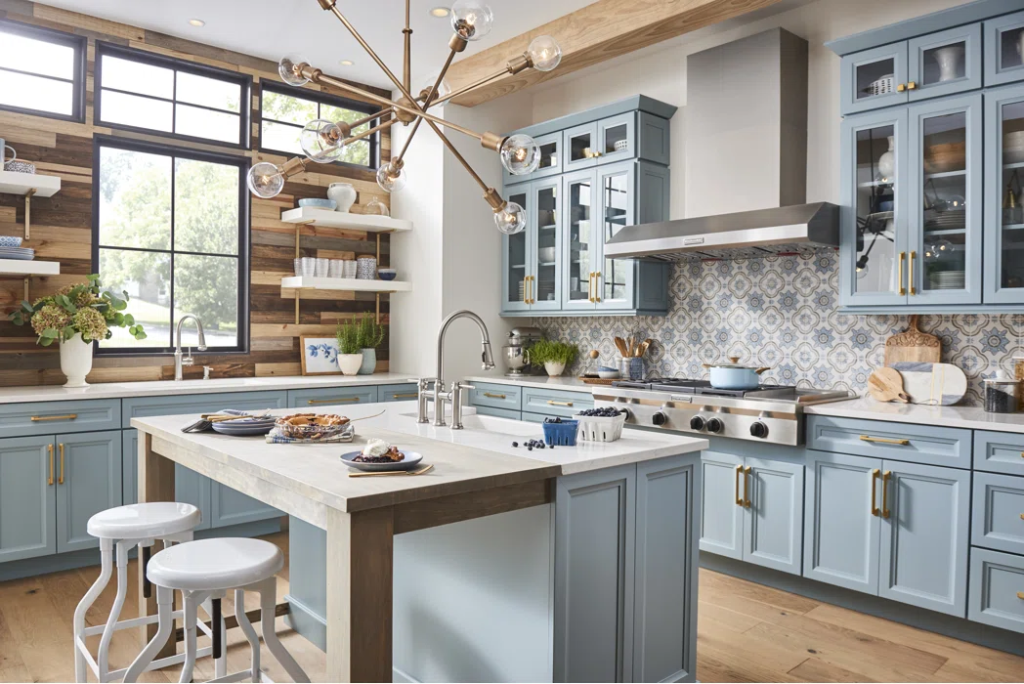

More than just the colors, the hues of the materials work effectively alongside too. In this inspiration above, the color palette of stone blue and brown indicated a warm and impactful ambiance for the cooking area. The saturated color of the wood worked a sense of balance with the stone blue cabinets dominating the kitchen. As usual, white acted as a balancer keeping the entire look more coordinated with one another. Engineered flooring established a rustic vibe to this farmhouse design too. It maintains the warmth of the space.
- White in Wood
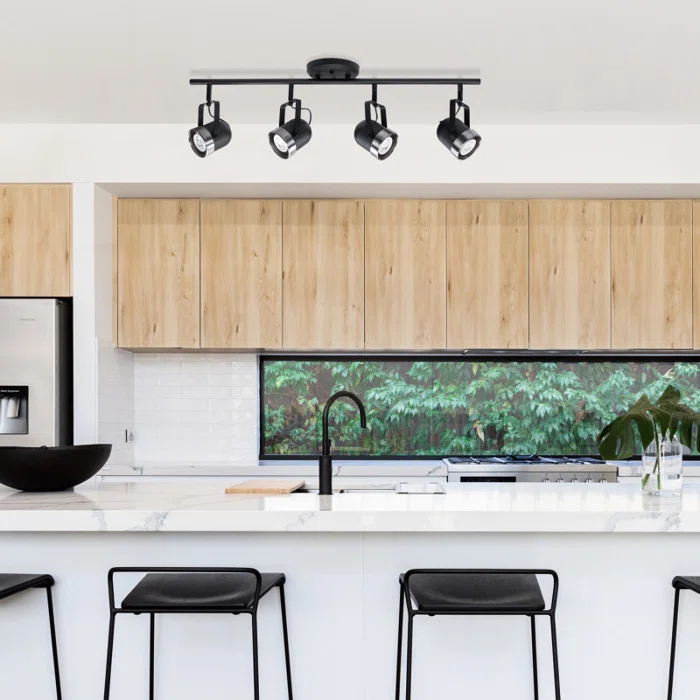

If you are up for a minimalist look, working with white color and wood material would give you an idea of how to turn things around in your kitchen. Thanks to the bright white color of the countertop and the brick-tiled walls, it allowed a sense of freshness of the surroundings. The minimalistic idea establishes cleanliness and order in the design. There may be more gaps to fill but simple kitchen colors will help in maintaining the space. We appreciate the matte black accents of the bar stools, faucet, and track lights. Dark-colored accents highlight the details of the kitchen. It did not make it look as if it was floating around.
- Sleek and Rustic
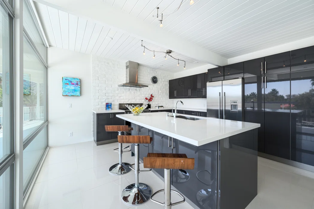

If you prefer simple colors to dominate the space, anchor grey and white will make the kitchen look luxurious and sophisticated. Focus on the sleek and rugged textures. We love its combination and how these materials make it easier to clean when the space gets messy. At first glance, white takes up at least 60 to 70% of the kitchen space. Even though, the sleek reflective finish of the anchor grey elements portrays elegance which is an important factor to maintain inside the kitchen.
- Puffy Palette
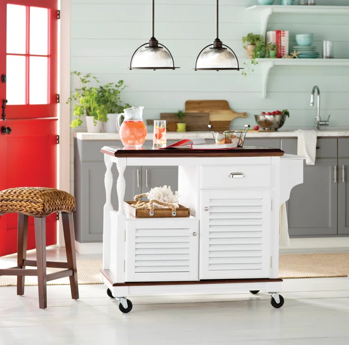

If you prefer combined muted, pastel, and striking colors, this inspiration will work for you. We love how these colors contribute to the freshness of the environment. Pastels may be subtle but they look cute too for the kitchen. It is a color you would love to wake up to in the morning to grab some coffee. This is a color ideal for small kitchen spaces considering how it makes the room look light and spacious. It draws attention to the walls giving an antiquated feel to a modern material.
- Tiles on Solids
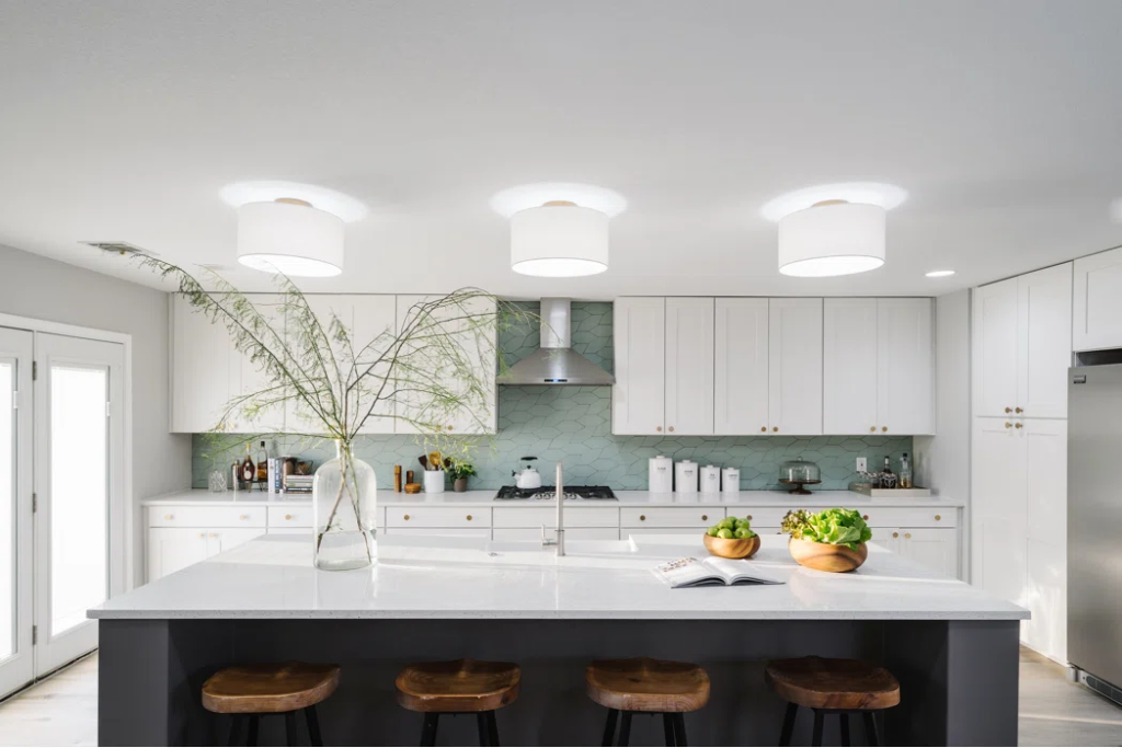

Mosaic-like tiles may not be the first thing you have in mind layered on the kitchen wall. Combined with white, it provides a clean and sophisticated look for the space. The mosaic pieces draw attention to the preparation zone of the kitchen. Incorporating these irregular pieces ensure that the rest of the room is spiced up with a subtle and muted backdrop as a gradual transition of the elements colored in white.
- Coastal Colors
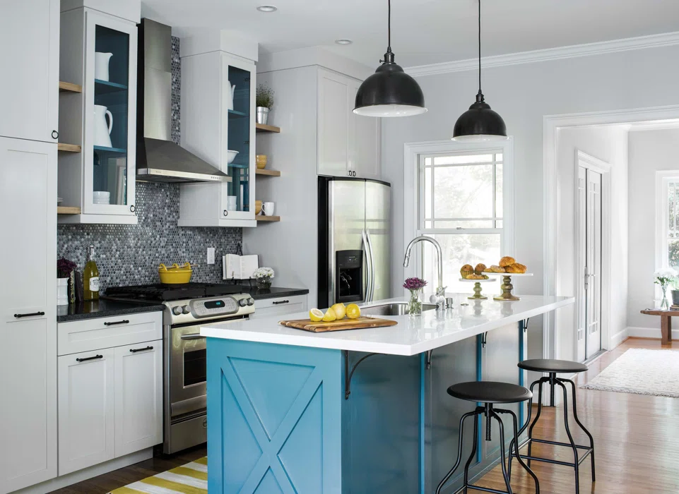

Blue may not seem the color to dominate the kitchen but it provides a cooling sensation to the space. The engineered wooden floors added a rugged quality of color to accentuate the farmhouse design style. This color introduces a new means of accessorizing the rest of the kitchen room. The small tiles in shades of blue-grey complement the white cabinets spicing up the simplicity of the entire facade.
- Nudes and Muted
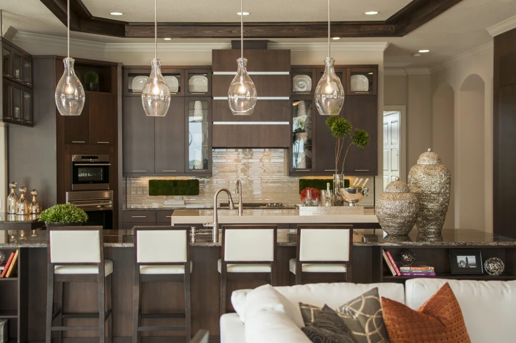

If you are planning for a post-modern look for the kitchen, you will love the brown and nude aesthetic. It sharpens the edges of the cabinets. The nude strip tiles on the cooking area gave a little pop to the room. Its light color and glossy finish indicated a sleek and stylish touch to the kitchen. What turned the tables around is the island kitchen table extended for a preparation table. It may come massive but it works more than just a place to have breakfast. To top the design off, metallics have their turn of indicating grandeur to the space.
- Faded and Saturated
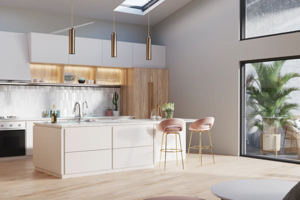

If you want to play with geometry, this inspiration is worth the try for the kitchen. The combination of cream and white gives the kitchen a fresh and vibrant look for subtle earth tones. Reclaimed wood for the cabinets adds a sweet touch to the cooking area. The touch of pink and gold from the bar stool indicated a blush to the kitchen. Accent colors are ideal if you do not prefer striking and bold colors to dominate the space. Using metallics to top it off makes the entire look grand and sophisticated. These hanging pendant lights in gold bring warmth throughout the kitchen space.
- Shades of Grey
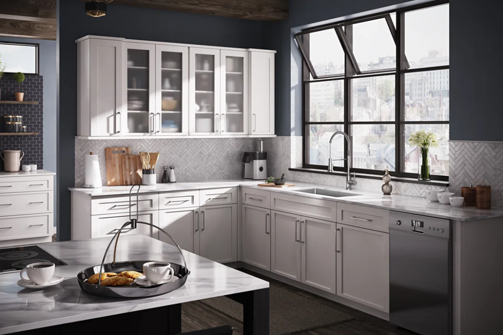

Shades of grey and white may seem to be a boring color to dominate the space but when properly accessorized with different materials. This muted kitchen is being perked up by glossy countertops and metallic details. It integrates to build a subtle yet impactful ambiance for the kitchen. The glass cabinets enveloped with wood holds extra room for kitchenwares and glasswares to make the countertops free from clutter.
- Cool and Neutral
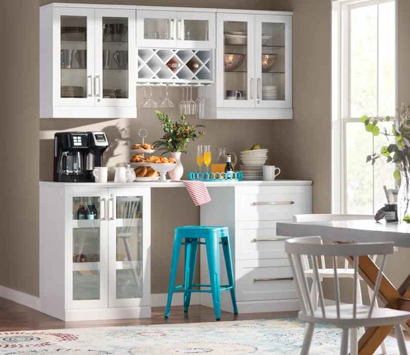

Nude and white colors set a neutral vibe. It helps in acquiring natural lighting throughout the space making it the perfect spot for mornings. The glass facade of the cabinets provided a more visual aesthetic for the stored kitchen and glassware. Since there is not much room for other decorations, allow the stored ones to be the decoration. To accentuate the room of muted colors, this vibrant shade of blue color for the stool made a huge difference to the existing colors in the room.
- Antiquated Shades
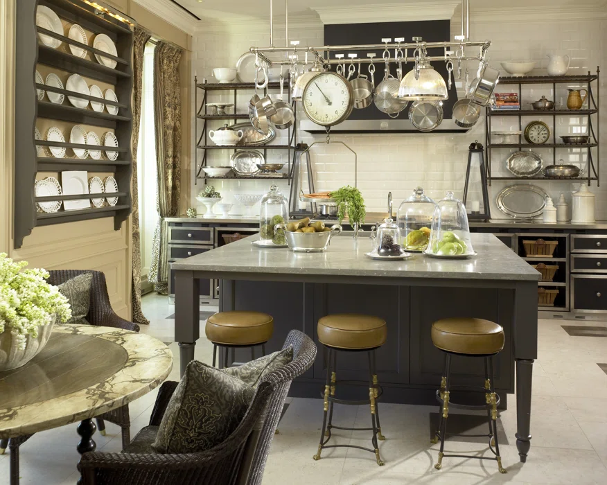

If you prefer a vintage theme dominating the space, you will love how these earthy tones made the kitchen warm and inviting. The cream white tiles for the preparation area are accentuated with the beige walls surrounding them. Instead of working with cabinets, industrial shelves in black steel made storage more accessible. What made this color inspiration more interesting is how light and dark shades complimented each other. The table, stools, countertops, and even the floors are combined with light and dark hues brought together a fresh scene for the kitchen.
- Warm Hues
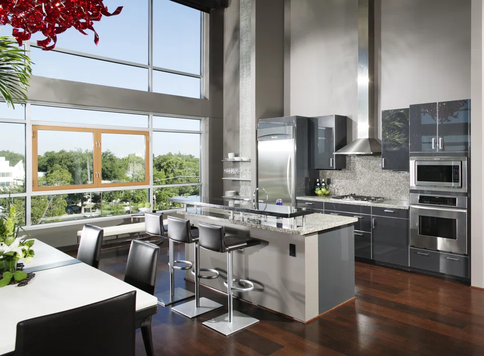

If you prefer a unified look for the kitchen knowing that it is an open plan, it can be difficult to start where the colors were left off. In this case, we highly recommend picking colors that are close to the other spaces of the house. Grey is a powerful color to work with. It may not be an ideal color to dominate the space with but they tend to make the spaces look flat. Thanks to the unique finishes of the materials, it upgraded the modern aesthetic of the kitchen. Through color, it set the zones of the kitchen. From the dining, cooking, and preparation area, different shades of grey were used. The flowing engineered wood flooring created a warm and antiquated aesthetic in this design.
