10 Ideas for Large Living Rooms
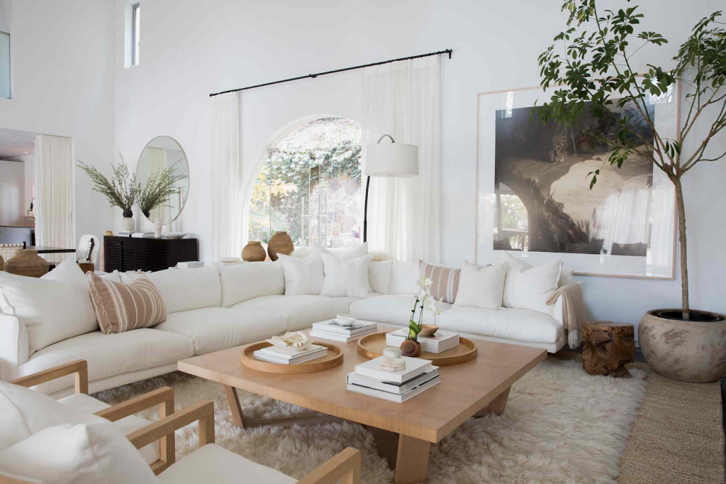

Designing a large living room is as challenging as designing small spaces. On average, bigger living rooms tend to cater to different activities than just attending to the household and guests. It works well with entertainment, relaxation, and even as simple as being a couch potato on an idle day.
Large living areas may be a dilemma for some but it sure does create a lighter environment for the household. Covering every square meter is not the case. Instead, unifying everything would make the design work without compromising the activities.
The living room acts as the reception of the house. It is the common ground connecting to the different spaces of the house such as the dining area, kitchen, living room, and bedroom. It can cater to different activities requiring comfort. Allow the living area to be cozy as it alleviates the idea that there are dull areas to cover.
The best way to design one is to bring together the elements and allow them to exhibit the balmy and light environment. In this article, we aim to provide enlightenment and free your worries in designing. Check out these 10 tips on how to make your design work in large living areas.
- Design According to Activities
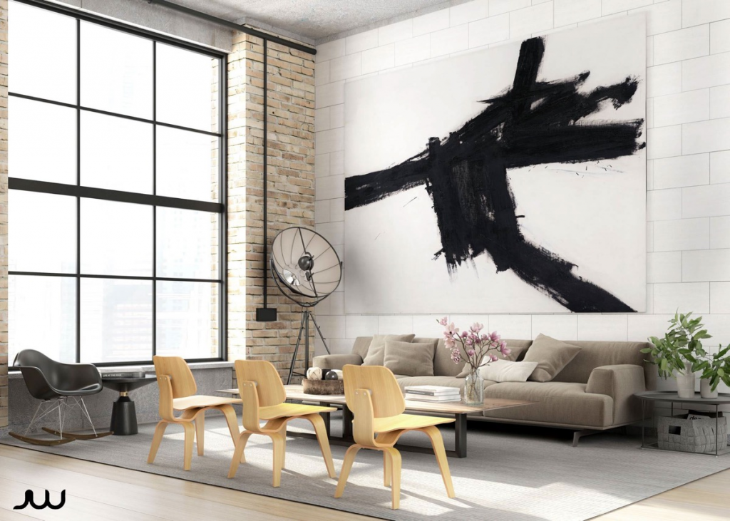

What are the usual activities the household conducts within the living area? List down the set of activities the household does including their interests. This will help you zone out the different activities and max out their circulation. Creating a bubble diagram is helpful to divide the space according to its occupancy. From the busiest spaces to the idlest ones, they must be separated with the absence of walls.
List down preferences for the space that will occupy the busy, thinking, reception, and entertainment space. Creating zones play a significant role in dividing the spaces according to their function and elaborate the meaning of each. The design must not compromise the comfort and activities of the living area. There may be a lot of space to cover but when properly zoned out, it wouldn’t cause trouble and unsystematic ambiance.
In terms of zoning, it would be best to define an intimate space perfect for reading or just plainly resting. It can work with elegant chairs with footrests next to a large window. Hence, it can also be used to cater to a romantic television dinner for two. The best trick in zoning an intimate space is to place it next to the busy area. It will help in overlooking the factors that living areas are not just for hosting parties and entertainment.
- Play with Different Patterns, Textures, and Color
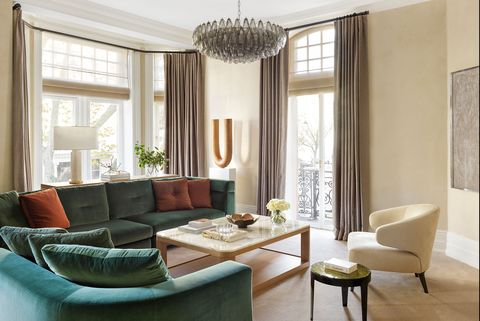

When it comes to large spaces, it is suggested to balance the use of different patterns, textures, and colors. Pick one of each that complements one another instead of overusing them altogether. One thing to consider is the visual impact of these elements on the users. Keep each element to a minimum to deliver an environment that is light yet functional. There may be plenty of options to choose from but experimentation and swatching would do the trick.
When it comes to patterns, choose where you would put them. Whether it be on the walls, ceilings, textiles, or flooring but not all. Define it as an accent to the wall and overlay it with colors that will highlight the pattern. Neutral, earth and light colors would do the trick. On the other hand, textured elements will add weight and visual impact to the living room. It is ideally preferred on the flooring or the textiles used.
- Unify the Style of the Furniture and Fixtures
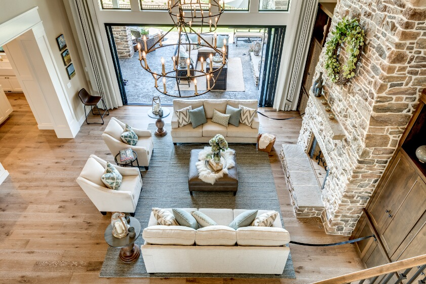

Identify the theme to be achieved in the living area. This will help in weighing in which furniture and fixtures would suit the space best. It is highly suggested to pick three types of upholstered furniture; one, two, and three-seating capacity furniture. These couches serve as the divider of the zones of the living area.
Another option would be the use of an island sofa. It can accommodate four to five people in just one seating. This is ideal for the entertainment zone of the living area. Picking the best couch depends on the number of people in the household regardless of their purpose. With the numerous options available, it’s not challenging to mix and match a few.
Oversized coffee tables or even ottomans will accommodate space dedicated to botanical pieces, magazines, and coffee. When an oversized ottoman is used, it can work as both a coffee table and extra seating when the living area is full. The balance it brings with the entire living area allows your guests to feel cozy and welcome.
With the right colors and materials, it brings life to the entire area without being cluttered. Ensure that the pieces of furniture placed are divided into two. One is dedicated to the busy areas and the other is for decorative purposes only. It is quite a challenge to place fragile decorations in busy areas. Dividing it into two would help in preventing breakages.
- Choose an Accent Wall
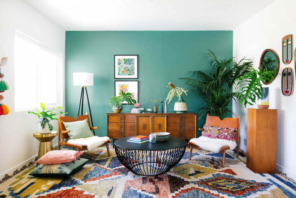

The living area or not, every living space is a sight to look at with an accent wall. Whether it be of a different color or different wall cladding material, it defines the change of pacing in the large living area. It may be a challenge for some but having an accent wall acts as a stopper.
If the entire space is painted in light or neutral colors, it will just overlay one another. It may be a paradigmatic choice for some but it is something that will work for large spaces. You can never go wrong with a splash of colors or materials whether it be wood, marble, or stone.
Observing the image above, the focal point is towards the accent wall. As it is colored in subtle earth green, it builds a cozy environment working well with the wooden pieces of furniture. The bold wooden countertop and the patterned textiles correlate with one another. It achieved a boho look without overdoing the design.
Work on the balance of materials, textures, and color. The accent wall will act as the mediator from all the other walls of the same color. On top of that, it can be an excellent choice where you can hang paintings and frames.
- Maximize Natural Lighting
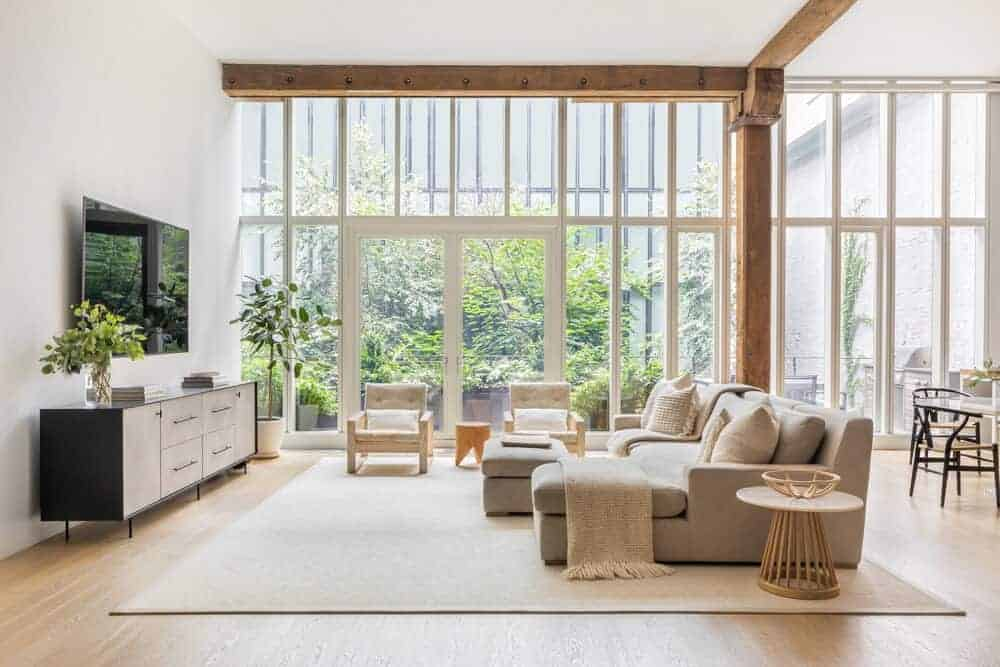

One existing factor that can be maximized in large living areas is natural lighting. Apart from the energy saved from using artificial lighting, it is a sustainable option in modern-designed homes. With a floor-to-ceiling window for panels, the objective is to acquire natural indirect lighting. This will help in maximizing natural lighting and minimizing the acquisition of heat from outdoors.
Glass is identified as a heat conductor. Therefore, the house must be designed according to its orientation. This will help the household prevent communal areas such as the living room from being used because of the scorching heat. Large windows for the living rooms are only effective if they acquire indirect natural lighting.
With the ongoing crisis of the environment, it is always a must to consider the locations of communal areas such as the living room. If it is not designed according to the orientation, chances are, it will just be wasted space that can only be used during cooler temperatures. The comfort of the household is the number one priority. Therefore, take time to evaluate the whole space before proceeding with the design.
- Balance the Scale
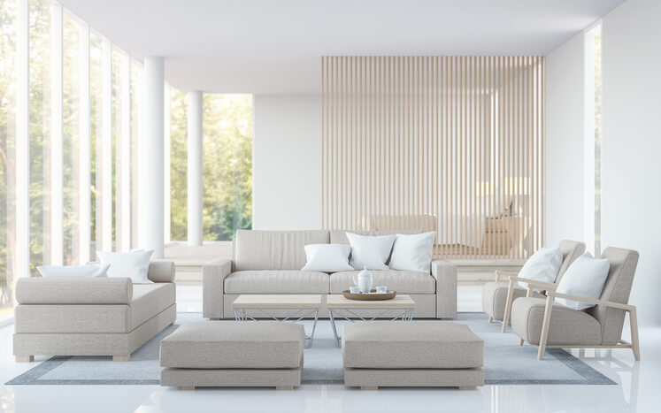

One of the common misconceptions in designing large spaces is the need to fill every square meter out. That is not the case. As designers, it is a must to practice balance in design. It doesn’t necessarily require symmetry. Instead, the balance of positioning the furniture, color, texture, and material. Less is more, as they say. That is why it is an excellent choice for some to plan out their ideal living area design before proceeding. Let this be an inspiration for your next large living room project.
The scale of the elements within the living area must match with the activities and the number of people in the household. How big or small should the furniture be? The trick in designing large living areas is to use masking or packaging tape to mark the spaces where you prefer the furniture to be located. This way, your options of the fixtures and pieces of furniture will be broken down. Whether the design is symmetrical or asymmetrical, as long as the entire space outweighs one another, that would be fine. Keep in mind that compromising the scale of the elements will compromise the design and the visual impact of the living area.
- Declutter the Living Area
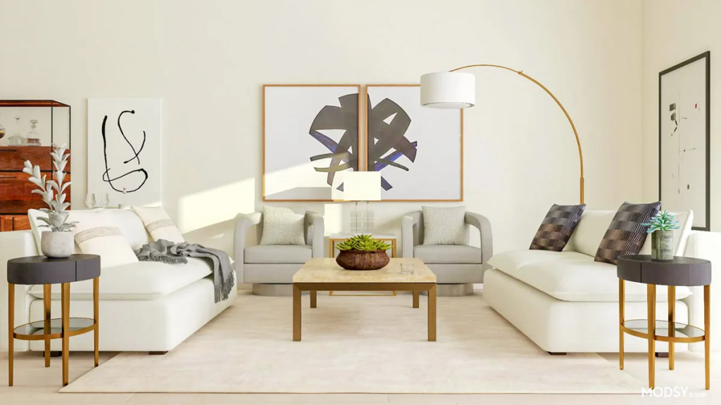

In large living area spaces, clutter can be easily seen. That is why it would be best to place the elements that are only necessary. Avoid overdesigning the space with decorations. Sometimes, the simplicity and minimalistic theme create a lighter impact on the users.
The example above exhibits the neatness of the arrangement. There are no extras used. They only placed the decorations which they think are necessary for the design. Considering that there are four tables on the image above, it is not required to fill it with magazines and picture frames. Keeping the accessories subtle allows the entire living room design to stand out.
Clutter is not only limited to the unnecessary objects in the living room. The minimal use of decoration did not make the design boring. It unified the elements together and stood out. The image above may look plain for some but there is something to look at every angle. They prefer hanging accessories such as paintings to overweigh the lack of other decorations.
- Choose Two Tones
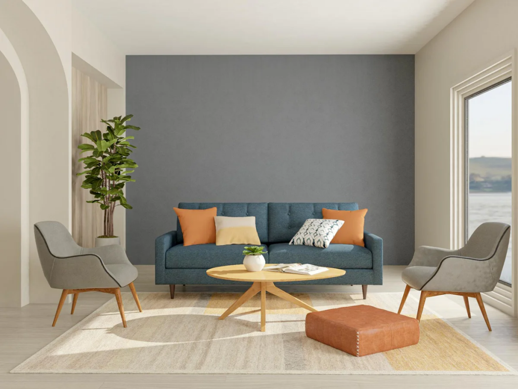

Choosing two tones for the wall will allow the large space to be subdivided. Not with walls but with color. It is similar to having an accent wall but it works not only on one wall. In a four-walled living area, you can use each tone for every two walls. This way, there is a sense of balance and highlighting.
There are times that some people prefer a plain sight of neutral or light colors because it makes it look clean. But, choosing two tones will make it look like a design that would work for large spaces. It breaks down the creases of unused space. Some areas may not have much furniture but it looks bold because of the different walls.
The example above exhibits two tones with two textures. The walls on the left and the right and the ceiling are painted with a matte off-white color. The second color for the focal wall is blue-grey in an eggshell finish. Smooth and textured surfaces enable the living area to define the zoning. In the image above, it is identified as the sitting area where you host guests or just relax on a gloomy afternoon.
- Design the Living Area Vertically
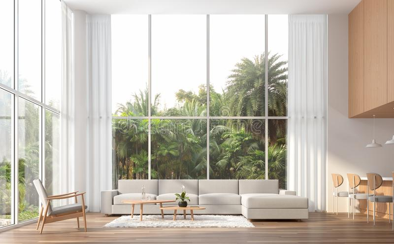

Large living areas are not just large horizontally but also vertically. Take into consideration the vertical aspects of the living area to maximize the design and to balance the elements to be put in place. Most large living areas are designed with floor-to-ceiling windows requiring a vertical clearance of four to six meters.
It may be a challenge in terms of its vertical design but there are ways on how to spice up the rest of the space. A trick would be to invest in lengthy sun shading devices such as curtains or Brise soleil. This will frame the corners of the entire space but at the same time, function as a protection from the sun.
- Illuminate with Expressive Lighting Fixtures
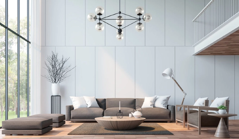

Lastly, pick two to three lighting fixtures that will complement the entire look of the living area. Lighting is often classified into three; main, complementary, and ambient. In the example above, the main lighting is the industrial-designed chandelier with cool and warm light color. The good thing about this type of lighting fixture is that they work as general and specialized lighting. It acts as accent lighting but at the same time, this light alone can be used without supplementary lighting. For the complementary lighting, the reading floor lamp is used. It is identified as specialized lighting often used for reading at night. Because of its direct lighting properties, it cannot be used as a general light.
