Living Room and Dining Room Ideas – 10 Inspirations to Try to Maximize the Space
These days, open-plan layouts for the common areas of the house tend to give a lighter and well-ventilated space. It may be quite a challenge to work with open plans in newly built houses and apartments and or existing home renovations. When you come to think of it, it has always been about proper laying out of the space. Define the zones of each space and elaborate their functions. This way, the design works in balance and harmony ensuring a cohesive and compelementing design for a home. What we look forward to is how the spaces will work hand-in-hand. We scooped 10 inspirations for a combined living room and dining room space that will preserve the versatility of each space.
- Light and Airy
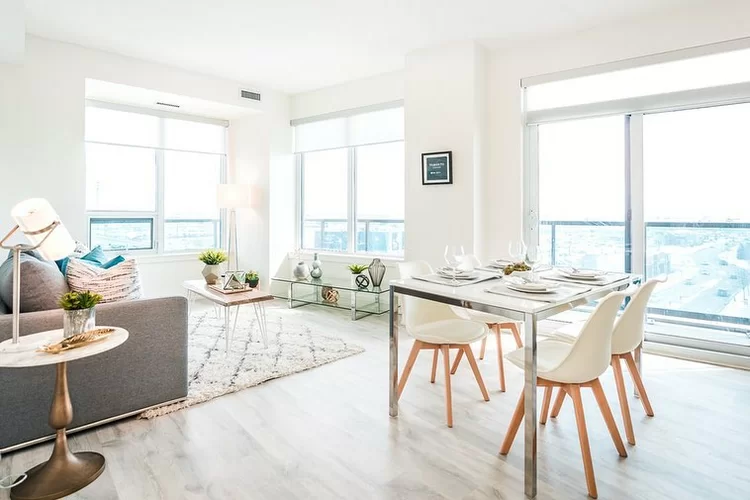

In every open-plan layout, most tend to put up dividers and invisible walls to set boundaries while some prefer the living room and dining room completely combined. In this case, the dining room belongs to the living room looking so light and natural. This is ideal for those who have limited space for seating furniture at home. After hosting a meal, the dining chairs can be used to gather within the living area. If you are looking for well-blend common spaces, we highly suggest using white on the entirety of the walls. It will make the space look like they belong or they are the perfect pair. Defining the zones of each space would suggest differences in the materials and finishes. Apart from the character they add, it establishes definitions and highlights their respective uses.
- Boho Chic
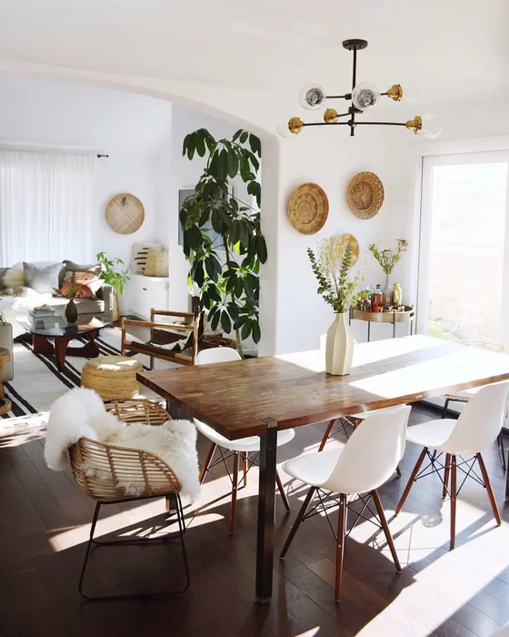

Using white walls help in making a space look vibrant. This is the ambiance we are aiming for, especially in open-plan layouts for the dining and living room. Because of the lack of walls, maximizing the space is a must but with the idea of preventing the space look congested. This boho chic vibe for a living and dining room exposes a warm ambiance considering the use of wood. The rustic finishes establishes dominance wherein the entire space looks natural. Wood as the dominant material induces durability and versatility. Choosing the type of material for an open-plan layout is crucial considering how its overall design would look. Always remember that the vibe should be evenly distributed to the space without looking too left out.
- Warm Solids
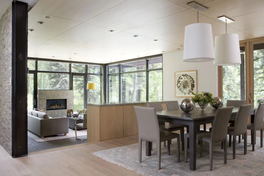

In modern design interiors, warm colors dominating the space are very common. Not because you are working with an open-plan layout does not necessarily mean that you have limited space. Sometimes, it is an opportunity to make the spaces more customizable. In this case, the two spaces are separated by countertops. The dining area is elevated by 0.20 meters from the living room making looking like they are not in one space at all. If a wall is not present to divide the space, be creative in dividing the zones to have a sense of privacy and intimacy between each. Even though we have the idea that they are in an open plan, we must ensure that the spaces are maximized according to their function. There are times when open-plan layouts may seem to be a little off or awkward because of the shared noise. With the right placement of furniture, these two spaces will be able to maximize the area.
- French Country
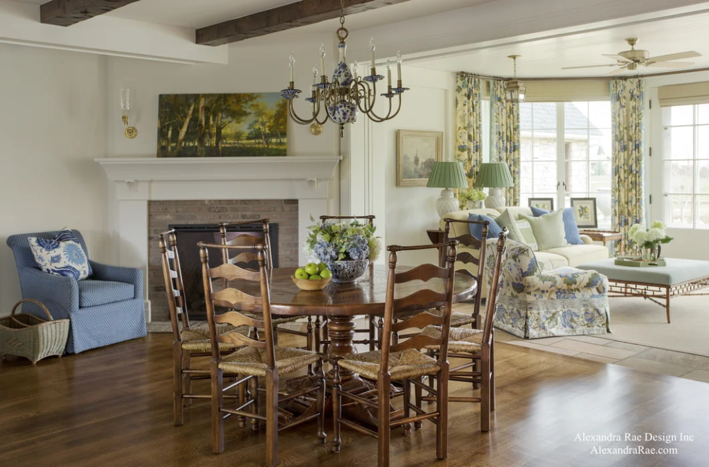

For antiquated interiors, open-plan layouts are very common. We love the highlighted details of the furniture and the finishes. As seen on the example above, you can see how they share the same wall yet you can define the difference in space because of the added window treatments. It sets the boundaries between two spaces. In addition, you can also set the zones using two different flooring materials. In this case, the dining room used engineered wood planks and the living room used stone tiles. Even though the materials used for the pieces of furniture are different, they still managed to complement one another in belonging to the same space. You can also work on the ceiling design along side. Observing the example above, apart from the lighting fixture, the ceiling design is different. They are of the same color but the one in the dining area has exposed complementary beams which added character to the design.
- Modern Bohemian
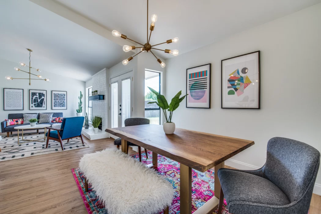

On a lighter note, open-plan layouts make the space more collaborative for the household. Even though it is a shared space, the function of each is identifiable. In the example above, we love how the theme is retained but managed to highlight the frontline of the household, the living room. What makes the design interesting is the puffy and comfy interior on both spaces. Sharing the same space meant having more room for large crowds. On top of that, having walls in between mean the air will not circulate well compared to this type of layout. Be distinctive when it comes to the type of material that will be used for the furniture. In this case, they opted for a combined sleek and fuzzy material. The color palette is a combination of light and dark colors that induces a sense of balance for the design of the space. Always remember that open-plan layouts should complement the combined spaces.
- Sleek Rustic Interior
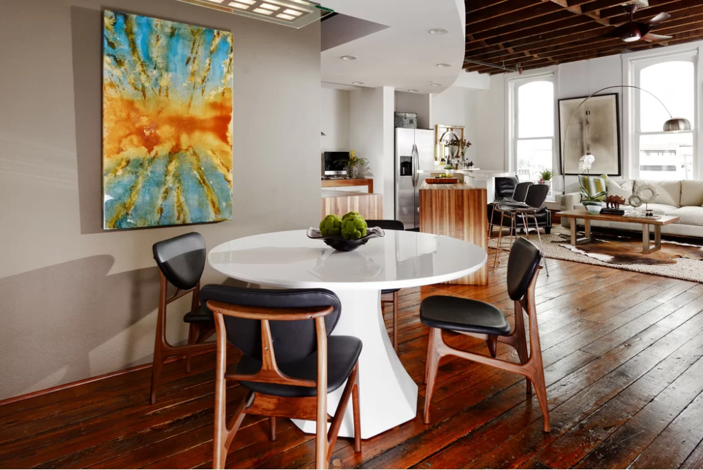

If you prefer a more intimate area to locate the dining room and the living room, make it a little distant from one another. They still belong to the same space but you can see how the zones are defined even with the lack of wall. The color palette for the kitchen, living room, and dining room is the same but each space has a focal point to look forward to. All the spaces have the use of wood as its common ground. The flooring flows from the dining area to the kitchen and living room making it look coordinated with one another. The flooring material plays an important role in making open-plans work. Instead of working with two different types of floor material, using a carpet will make a difference. It is customizable and at the same time, it makes a huge difference to the aesthetic impact of the living room.
- Flat Life
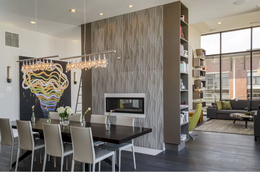

If you prefer more intimacy for the living room and the dining room, use furniture to set their zones. Instead of using a wall, the designer opted for a bookcase to serve as the divider. What we love about this idea is how it did not make the space congested but did a great idea in setting boundaries. Be creative in setting boundaries for the two spaces. Besides, not all are fond of open-plan layouts. Some prefer a more intimate and private space to host dinner or have a casual wine night with friends. The vibe built for the two spaces are made cozier by the lighting fixture and the built-in fireplace. Apart from artificial walls, work with the layout of each space. In this case, the dining room is perpendicular to the layout of the living room. With the wall in between, you can barely see the people on both spaces when seated or dining.
- Traditional Hues
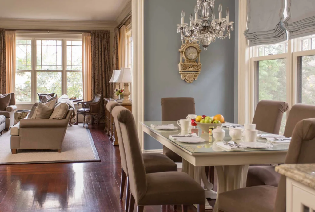

Vintage houses are often designed with minimal walls for the public spaces. They tend to induce a more collaborative ambiance for the household allowing them to interact. Even with the lack of walls, open-planned layouts tend to acquire more natural light and induce a well-ventilated space. If you want to work with setting boundaries on both space, we highly suggest to work with two different colors for the walls. It helps in establishing a character separating the living room and dining room. Always remember that you have to work on how to set the difference between the two. The living room is the frontline of the house therefore it should be highlighted. Make it the center of attention as soon as one enters the house.
- Eclectic Character
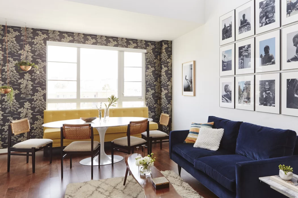

If you want a combination of a variety of design styles, eclectic style would suit your tastes best. What we love about this style is how the materials and color set divisions in open-plan layouts. In this case, the space is designated for the living room and dining room. Even though they are two different spaces, you can sense the feeling of being in a different space because of the transition of materials. We love how they highlighted both spaces using the walls. The designer opted for a warm-colored wallpaper for the dining area and a series of framed images for the living area. They may be next to each other but still managed to set the zones without the use of walls.
- Post-Modern Life
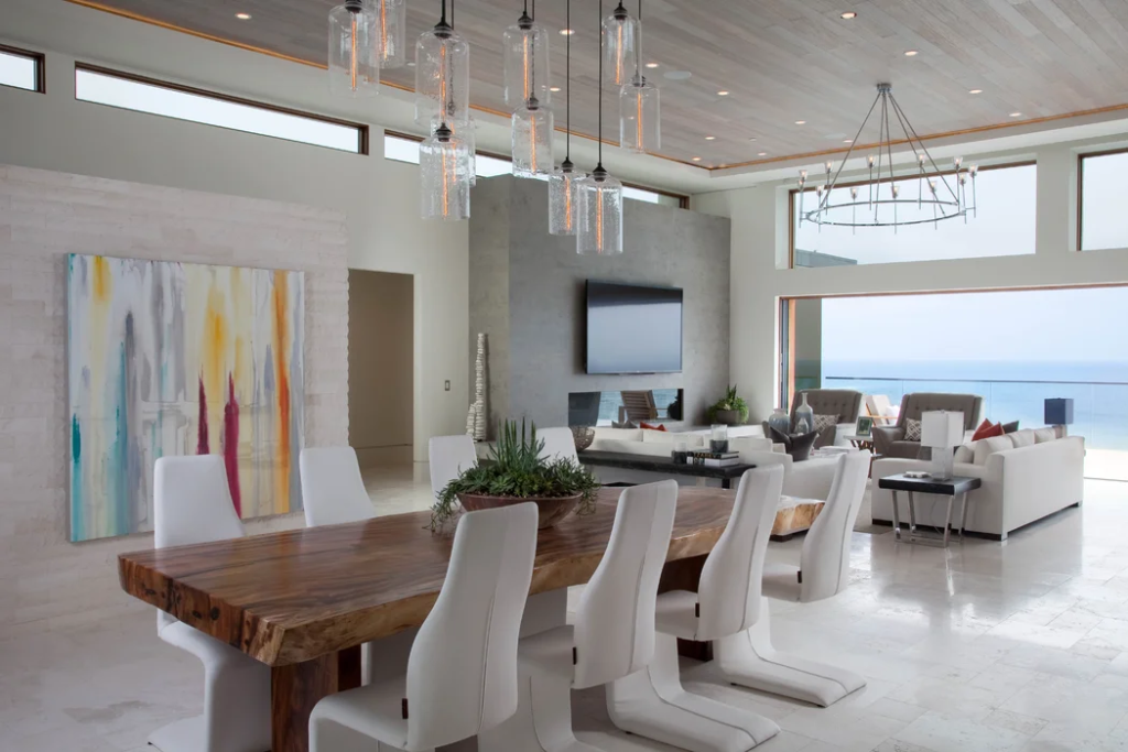

Perpendicular layouts work well with open-plan living and dining area. They are a more direct approach of setting up two spaces in one. Some may be bothered of how the space will lack sense of privacy and intimacy yet with the right pieces of furniture, it will establish differences between the two. In this case, the living room is in U-shaped with the television as the focal point. Meanwhile, the dining area is placed parallel to the artwork. Even though there are no dividers used in between, the differences in wall material and focal point established dominance in each space. Besides, having the dining area close to the living area will help in catering to more guests during parties with big crowds.
