10 Minimalist Living Room Ideas to Check Out
Minimalist design is the biggest design concept of the 21st century. There is no doubt about it spicing up your living room for they dwell on elements that are straightforward but impactful. The minimalist design will make you realize that designing with less can be fun too. From Instagram to Pinterest, there are endless variations of how to design a living room. With that in mind, we have 10 minimalist living room inspirations to prove that it is worth every other design concept. It is time to declutter the space and focus on what is necessary. Let us design your living room in the simplest yet most impactful manner. Besides, less is more, right?
- Blues Clues
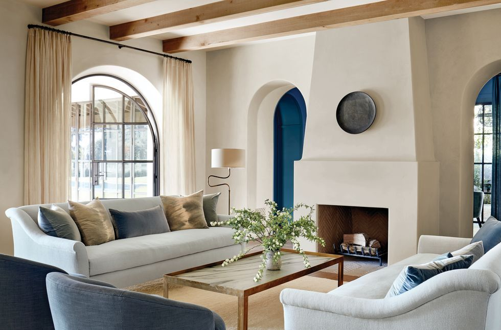

Blue is not often the color found in minimalist interior designs. But, as it is a cool hue, it can work effectively in flat and simple elements in the living room. We have here a design inspiration from Elle Decor. It is a design fixated on subtle warm and cool hues to balance the aesthetic in terms of color. The key design here is the slanted fireplace that served as the centerpiece. It directed all the seating furniture towards the fireplace where the household and guests can gather. It is designed for large households but not children-friendly due to the sharp edges of the coffee table. If you want a minimalist design but do not want to settle with monochromatic hues, blending cool and warm tones. It is always to top off your living room with indoor botanical plants that you think would complement the look.
- Light and Warm Harmony
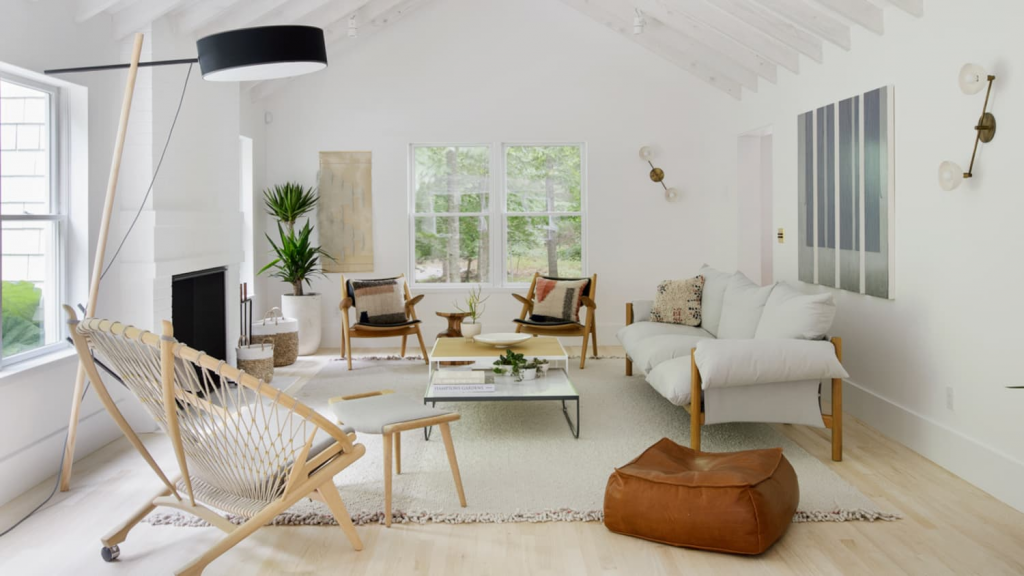

It is not always dwelling on blank and plain elements for it to be called minimalist. Thanks to this exemplary inspiration from Apartment Therapy, we have this light and cozy vibe with the tones used. Wood is the predominant material for the elements which is cool since most of the pieces are designed in the industrial concept. The dominance of white in this design made the room look flowy. It helps in acquiring more natural light to the room making it look bigger. White is a clean color that just makes everything look neat and in order. The key design here is the mesh-type armchair on the left side. It is definitely a place you want to lounge in while drinking wine after a long day. To top off the minimalist design, you better look for indoor botanical plants that can accentuate the design.
- Minimalist Scandi Taste
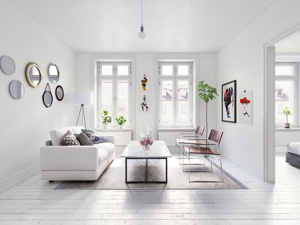

Don’t you just love how the whites of different textures did not make the entire room look plain and boring? With the glossy sleek walls with different hanging ornaments, they added spice and color. It is the sense of geometry that binds the design. We love what Michael Murphy Home Furnishing did to the walls. The series of circular mirrors created a bouncing design of the wall art opposite to it. In addition, the industrial leather armchair on the side has a very simple and less bulky vibe. Even when almost everything is in one color, the designers managed to make it more interesting by investing in the intricate details. They focused on the shapes and textures to be used.
- Sharp Edges
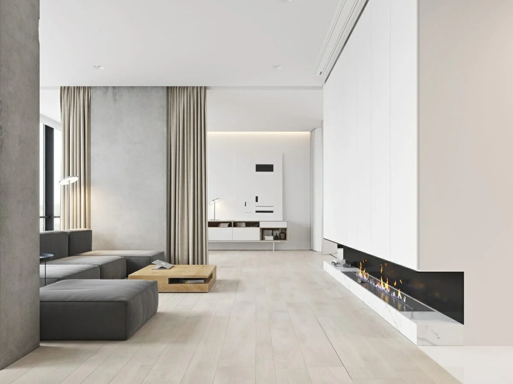

In terms of uniformity, minimalism dwells on the idea of neatness and order. Look at how Decorilla killed this amazing minimalist design inspiration. It is the linear details that exhibited the classic metro modern vibe. When looking for the perfect pieces of furniture and fixture, choose the ones you think would best fit the puzzle. In this case, they invested in a massive sectional couch in warm grey. The quarter cube coffee table fit in perfectly. Apart from the fact that it is space-saving, it has a designated space for the living area. On the other hand, we love the design of the fireplace. It broke the traditional design. This is simpler and free from dust and debris.
- Classy Neutral Vibe
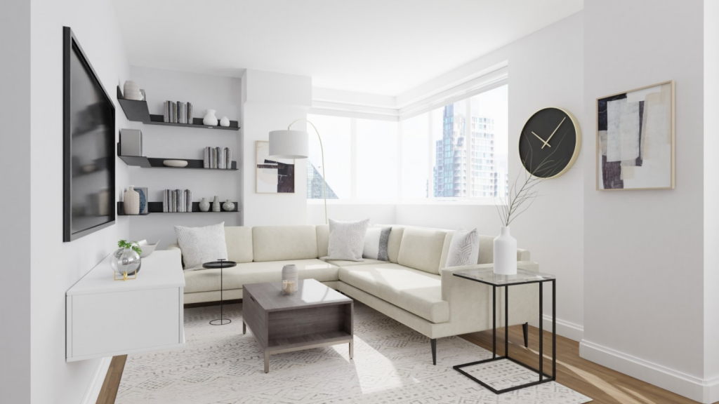

If the space for the living area is limited, the more reasons to choose the minimalist design. In this case, we have a design inspiration from Spacejoy. The room is approximately nine to twelve square meters. Choosing the minimalist design for a room this small means there is no space for clutter. Everything that will be placed is only the essential ones. Look at how the shelves are organized, fitting perfectly next to the structural elements of the room. The design is a combination of linear and curvature elements. To top it off, the hues of white, black, and grey. The materials used are pretty straightforward too. The polished engineered wood panels for the flooring added warmness to the scheme of the living room.
- Clean Polish
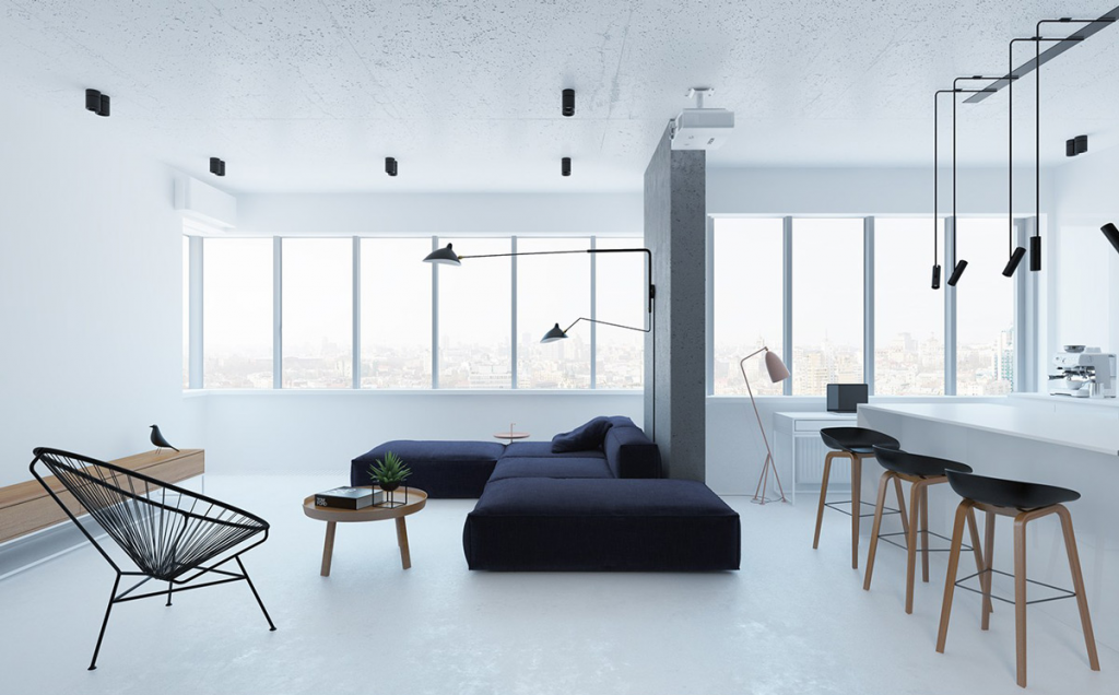

In bare units, you have the opportunity to be flexible with the design. The opportunities for natural lighting reflect the color of the walls making them look light and airy. In this case, Interior Design Ideas opt for a sectional couch as the key design. Its bold black color added something to look at in the living room. The colors are pretty focused on black, white, and brown. On the other hand, the materials used were similar to the industrial design concept. This is perfect if you want to keep the living room simple. The key design here is the mesh armchair on the side. It is not every day you get to see a chair designed like it. It balanced out the massiveness of the couch.
- Subtle Nudes
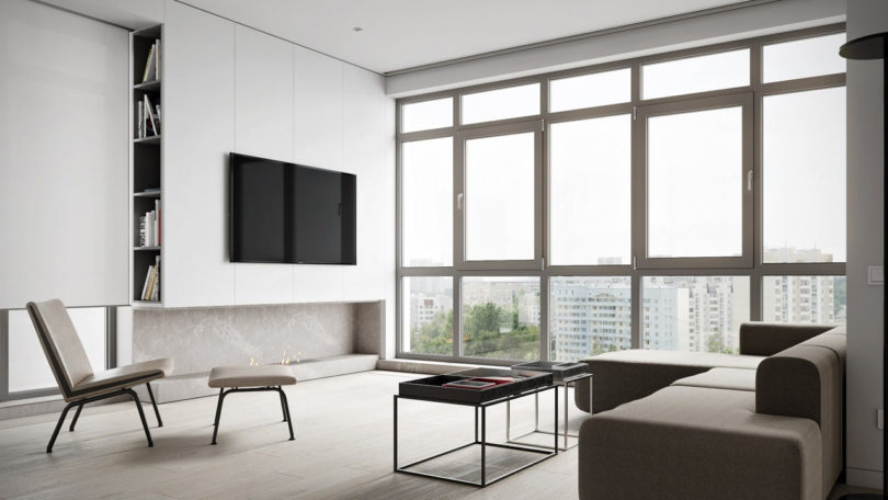

If you are not a fan of white, maybe choosing colors closed to it might just do the trick. Design Milk opts for subtle nudes. These are colors closed to white but with a little touch of beige. This is perfect if you want to keep the living room warm and not acquire too much light. The opportunity for natural lighting here is massive, yet managing the wall color is one way to keep it at a minimum. In this design inspiration, we love how the structural framework of the coffee table and the side chair is visible. It balanced out the solid sectional couch. Sometimes, there is no need for excessive design to make it work. Less is more. As long as everything you need is in front of you, it will work. This design proves that the minimalist design for a living room works evidently.
- Sleek Curvature
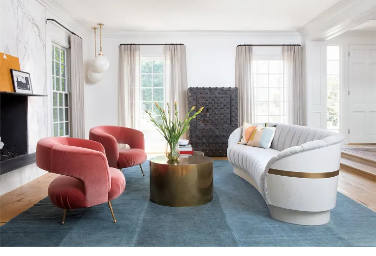

Edgy designs on the side, we have here a fancy minimalist living room inspiration from Pinterest. What makes this design sleek is that the view is fun to look at. It is beyond the traditional look for a living room. It is not something you would expect for a minimalist design, but elements complement one another. We love the larch peach armchairs upholstered in suede textile. It is smooth and sophisticated to look at. The white semi-curved white couch proved its true minimalist form. With its curves, it added a free-flowing character to the entire design of the living room. The center of the living room is the gold coffee table. It establishes grandeur in the simplest way possible. Not because this design is minimalist, does not make it exempted from being sophisticated.
- Rustic Minimalist
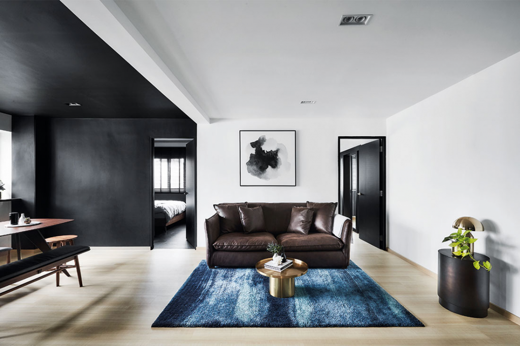

Among the nine other inspirations, this one from Lookbox Living is the most minimalist. This is counted as a compact design working on an open plan. In this case, they used color to divide the room instead of walls. The black walls and ceiling are perfect for the dining room making it more intimate. On the other hand, the white walls and ceiling are perfect for the living area to brighten up the mood. It looks refreshing to look at in the morning. What we love about this layout is how straightforward it is. There is no need for other unnecessary elements. What you see is what you get. To keep the design iconic, the living area is topped off by the acid wash cerulean carpet.
- Earthy Stains
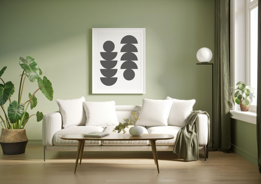

Not all are a fan of the hues of white and beige. To add flavor to the walls, sometimes, it is best to choose a refreshing yet impactful color. In this case, pastel green. In minimalist design, you need to have fun with the accents. It balances the intensity of the color. Off-white and pastel green gave this subtle relaxing vibe. As a living room next to a window, the couch is perfectly placed next to it. It looks cozy and inviting for the household and the guests. The design made it look like an intimate place to yourself after a long and tiring day. The wall art exhibits value and symmetry. It gives the room a sense of direction. Invest in great wall arts that you think would add character to your walls. Always consider the color, design, shape, and texture.
